
Write something

Dec '25 •
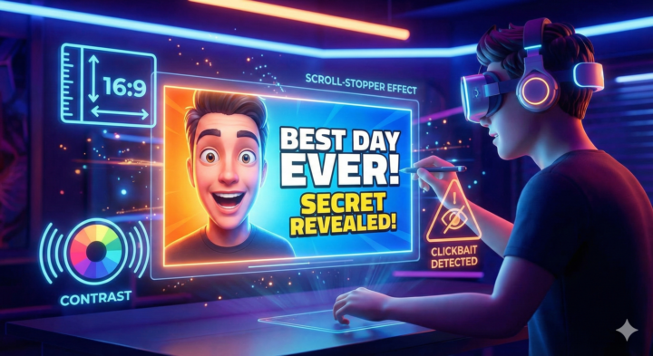
Why Your YouTube Thumbnails Are More Important Than Your Video Title 🚀
If you want more views, watch time, and growth on YouTube, your thumbnail isn’t optional, it’s essential. Think of your thumbnail like a mini billboard for your video. It’s the first thing people see when they scroll through their feed, and in less than 0.3 seconds viewers decide whether to click or keep scrolling. Here’s what separates a scroll-stopper thumbnail from a scroll-past: 🔥 1. Big, Clear Images That Tell a Story Use high-quality images,ideally photos you shoot yourself rather than blurry stills pulled from your video. Faces with real expressions work especially well because they communicate emotion instantly. 🎯 2. Punchy, Minimal Text Keep text to a few strong words. Too much text gets lost, especially on mobile, where most people watch YouTube. 🎨 3. High Contrast & Bright Colors Use colors and contrast that stand out on YouTube’s interface. Primary colors and strong contrast help your thumbnail pop against the sea of content. 📏 4. Correct Size & Aspect Ratio Make your thumbnails 1280×720 (16:9) in JPG/PNG under 2MB, this ensures they look crisp on screens big and small. 🧠 5. Be Honest, Don’t Clickbait Your thumbnail should represent what people will actually see in the video. Misleading thumbnails might get an initial click, but they hurt watch time and your channel’s reputation — and YouTube is cracking down on that. 💡 Quick Tip: Test thumbnail variations to find what resonates best with your audience — YouTube now lets you A/B test thumbnails and titles to boost CTR and watch time. If you need help with your thumbnails or YouTube strategy, contact me at Daniel@MonsterKong.com
Dec '25 •
🎥 Why YouTube Is Becoming a Lead Machine for Real Estate Agents
Most agents don’t realize how powerful YouTube has become for generating consistent, long-term business. A few quick facts: ✅ YouTube is Evergreen, your videos keep working for you for years, not days like TikTok or Instagram. ✅ It’s the #2 search engine in the world, buyers and sellers literally search things like “Moving to [Your City]”, “Cost of Living in [City]”, and “Best Neighborhoods in [City]”. ✅ Longer videos = trust. A 15–20 minute YouTube video builds more authority than dozens of short-form clips. That’s why YouTube leads convert at some of the highest rates in the industry. ✅ Success comes down to 2 numbers: • CTR (click-through rate) → how many people click your video • Watch time → how long they stay Master these, and YouTube will push your videos to more viewers for free. If you’re creating content as an agent, YouTube isn’t just another platform. it’s a long-term asset that compounds, ranks in search, and positions you as the local expert. Need help with Growth, Leads or Branding on YouTube, please reach out at https://monsterkong.com/
0
0

Nov '25 •
The X algorithm just changed again
I‘be been researching the new updates and here's what I learned: - Post no more than 4 times a day - Reply to both BIG and SMALL accounts - Quality posts, but if you use over the max characters it deboosts - Images on EVERYTHING, text based posts are considered scams - Anyone with more than 3 profiles mentioned in their bio is deboosted - People from England are deboosted, VPN to access the site if you live there - American Accounts have the highest reach on the timeline - Posting positive interactions with X team boosts algo - Profanity is no longer considered a 'negative engagement - Receiving a single community note shadow bans you for 24 hours Go test this for yourself and see what happens, the results might surprise you.
Oct '25 •
How the YouTube Algorithm ACTUALLY works (and why most people get it completely wrong)
Everyone thinks YouTube "tests" your video on a small group first And if it performs → it blows up If not → it dies But it's NOT that simple (bookmark this)
Oct '25 •
The Best Time To Post
↓ Read & Save for Later Still guessing when to post on Instagram? 🤔 You might be hurting your reach without realizing it. Here’s the truth 👇 Instagram’s algorithm now boosts posts that get fast engagement, especially saves, shares, and real comments, within the first hour. If your followers aren’t online when you post, the algorithm won’t give your content a fair shot. Here’s how to fix it: ✅ Post when your audience is active → more visibility ✅ More visibility → more engagement ✅ More engagement → the algorithm keeps pushing your post further 🚀 Find your best posting times in 30 seconds: 1️⃣ Go to your profile 2️⃣ Tap the ☰ menu (top right) 3️⃣ Click Insights → Total Followers 4️⃣ Scroll to “Most Active Times” (check both days + hours) 📍 Note: Times are shown in CET — adjust for your time zone . Want your social media handled for you, with content that’s strategic, aesthetic, and drives real results? "DM Me” or book a call @ https://www.monsterkong.com/ and let’s talk about leveling up your brand presence 💬

1-10 of 10

skool.com/exp
Welcome to eXp Academy, expert Social Media Training, Tools, & Community to grow your Skills, Brand, Income, & Long-Term Success.
Powered by