
Write something


13d •
Hello!
Hi everyone! I'm an aspiring Data Analyst. Happy to be here and excited to level up my Excel and analysis skills with this community! Would love to chat with data nerds.

Dec '25 •
What Excel Creation from 2025 are you Proud of?
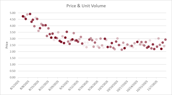
I know some of us do most things at work and may not be able to share a screenshot (myself included) but let's hear what are the amazing things you've created / done in Excel this year! I'll Start us off. ⬇️ _______________________________________________ I do a lot of work in forecasting and analysis and showing how a metric trends over time (like a product's price) is pretty standard. Line charts work, dot plots work also. But I also needed to show how many units were getting sold each of these days. You can overlay a bar chart, and that works, but visually communicating volume works great if each dot gets lighter with less volume. And that's what this chart does. Solid Dots have high volume. Very light dots have very little volume. Your eye immediately sees where volume is greatest, and has the biggest effect on results. I used this visual to help explain a hot-button issue and it immediately got shared with executives in multiple departments — big credibility booster. What's something you're proud of? — New Function You Learned — Process you improved — Challenge you Overcame

Apr 6 •
Hello!
Hi everyone! I'm an aspiring Business Analyst. Happy to be here and excited to level up my Excel and SQL skills with this community!
Dec '25 •
One Thing I've Learned
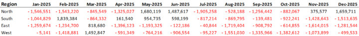
Out of all the things I've picked up about analysis and working in Excel, probably the most under-rated thing is getting clean data. And by "clean" I mean like a csv file with each row being one record and each column being a different data field. Once you've got that, you have all kinds of wizardry at your fingertips. You probably have had to deal with pulling data out of a file that's organized like the first picture. It's quick to build things that way, but then doing year-over-year analysis becomes time consuming. But if you can get the data into a clean table like the second pic, then you have many more options. You can run a pivot table, export it for analysis elsewhere, search it, add additional columns with relevant metrics — the options you have multiply quickly. The key is structure. Structured Data gives you flexibility. And Flexibility lets you say, "Yes, I can do that" when others struggle. At work I have one pivot table that has more than a million (I think it may be 2M) rows of data behind it. It lets us look at trends on a daily basis for the last 7-8 years and its at the transaction level. Every transaction. Need to see monthly seasonality? No Problem. How product mix has evolved? No Problem. What's the effect on prices with one product that's under a recall? No Problem. Well structured data is like good infrastructure: nobody wants to build the big road, but once it's built, everyone wants to use it and it's hard to imagine what it was like before. Take the time. It's worth it.
1-30 of 36

skool.com/excel-analytica
Mentorship community for business analysts to grow their skills in Excel, SQL, & Automation.
Leaderboard (30-day)
1
+2
2

+1
3
+1
4

+1
5

+1
Powered by