

🚀
Oct 25 •
Monthly Website Reviews | Submit yours for next month
Thanks @Farid Hans @Itamar Ribeiro! Great websites but could do with some more transactional pages. If you want me to review your website you can submit THIS form. You do have to get to level 3. We'll do one next month. If you have any questions about either the website review, my thoughts around it, or any of the tools that I use, just leave them in the comments below.


Sep 13 •
🎉 Big congrats to our Level 3 members! 🎉
You’ve officially unlocked: Website Reviews - Level 3 👉 Hit Level 3, and you can now submit your website for a personal review by @Nicolas Gorrono. At the end of each month, @Nicolas Gorrono will record a detailed video review of every site submitted packed with advice on how to improve your SEO and boost your rankings. 📩 Enter your website details HERE Tagging our Level 3 members 👇 @Max Gibson @Raquaza Moss @Audun Nilsen @Steve J @Caroline Bogart @Ray Makara Keep climbing the levels, the rewards only get better from here! 🚀
🚀
Sep 30 •
Join us Live | Get your website reviewed
https://www.youtube.com/watch?v=wn-zpRbEEVI comment your site here and watch the youtube live
🚀
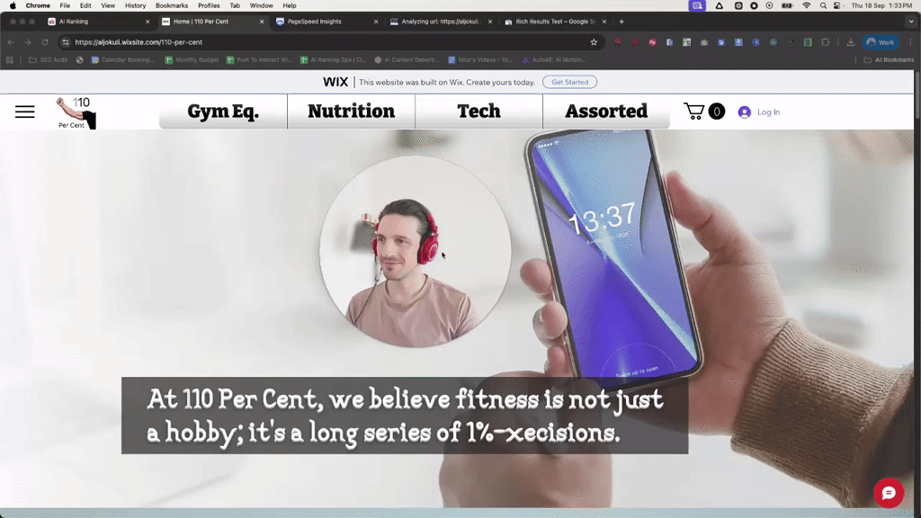
Sep 18 •
First Website Review | Audun
If you want me to review your website, all you need to do is get to LvL 3 and submit your site HERE @Audun Nilsen thanks for submitting the site. Website Review Feedback: 110% (aljokuli.wixsite.com/110-per-cent) General Observations - The site is confusing and lacks clarity about what it offers. Visitors should understand the purpose of the site within one second, but currently that isn’t the case. - The design choices (rotating banners, AI-generated images) hurt credibility and user trust. - There are no clear calls to action (CTAs), which means users don’t know what to do next. Design Issues - Rotating banners: These distract instead of inform. They prevent visitors from grasping what the site is about. - Images: Many images look obviously AI-generated and “fake,” which damages trust. - Layout: Dead space and repeated menus add clutter without purpose. Content & Messaging - The main tagline doesn’t communicate clearly what the site is about or what users should do. - Conflicting themes (fitness, food, gadgets, massage, even phones) create confusion. - No strong CTAs like “Shop Now” or “View Products.” Technical SEO Problems - Title tags: Defaulting to “Home, 110%” is meaningless to both users and search engines. Each page should have keyword-focused titles. - Meta description: Missing entirely. - Schema markup: Absent, so Google can’t properly interpret the site. - Keyword targeting: No evidence of clear keyword strategy; Google has no idea what the site should rank for. Functionality Issues - Social media icons link to Wix placeholders instead of real accounts. - Product pages aren’t optimized for e-commerce (unclear if items can even be purchased). Recommendations 1. Clarity First: Define exactly what the website is about (fitness gear? healthy lifestyle products?) and stick to it. 2. Redesign Homepage: Remove rotating banners, add a clear headline and CTA above the fold, and ensure images look authentic. 3. SEO Basics: 4. Fix Navigation: Simplify menus and remove duplicates. 5. E-commerce Optimization: Ensure products can actually be purchased and descriptions target relevant keywords. 6. Social Proof: Replace Wix social links with actual brand accounts. 7. Education: Work through the Technical SEO section of the course before further development.
1-4 of 4

skool.com/ai-ranking-free
Start you AI Powered SEO journey & learn to rank #1 on Google
Leaderboard (30-day)
1

+5
2

+5
3

+5
4

+4
5

+4
Powered by