Activity
Mon
Wed
Fri
Sun
Mar
Apr
May
Jun
Jul
Aug
Sep
Oct
Nov
Dec
Jan
Feb
What is this?
Less
More
Owned by Wesley
Executive skill = show up, plan, execute. Agency for every life situation. Not one & done, but a journey to a life of leadership and purpose.
Memberships
Zero To Founder by Tom Bilyeu
2.3k members • $119/m
Inspired Life, Empowered Being
124 members • Free
Start Writing Online
19.7k members • Free
Authority Through Authorship
70 members • Free
Typographic North
95 members • Free
Virtual Assistant
540 members • Free
Digital Profit Builder
232 members • Free
Founder Recomp 90
5 members • Free
AI Automation Club
288 members • Free
10 contributions to Typographic North

🔥
16d •
Is it really a book?
Many people get the idea to publish a book, either on their own or with help from others. It could be a collection of poems they've written over the years, or a novel they're working on, or perhaps some business advice they want to share. But before we move too fast into a book project, let's take a step back. Is it really a book? If you have ideas you want to communicate, there are many ways to do so. You can make - an article series in a magazine or newspaper - a podcast series - an online lecture - a searchable website - a Facebook page - an email series - a YouTube channel - a Skool community Or other forms of expression and channels. Whatever you want to communicate, think through different ways to tell the story. Not everything needs to be a book lying on the table in a bookshop. Putting together a good book is often a long and complex process with many people involved. It takes time and can become expensive. And even if the book turns out well and can be ordered in bookshops or bought online, there's no guarantee there's a large enough audience for significant sales or wide distribution. But of course, if you are a decent writer (or know someone who is), you've had signals from people around you that they'd like to have a book in their hands on the subject – and you strongly believe in the idea yourself – then you're well on your way to starting a book project! If you'd like help planning the project and designing a good book, you can always message me here on Skool or book a call to see if we can work together.

1 like • 16d
I like this idea of "make your mark on the cave wall", @Erick Aroldo! Very humanistic. What "cave wall" are you working on these days?
1 like • 15d
Wishing you massive success, @Sarah Patricia
🔥
Oct '25 •
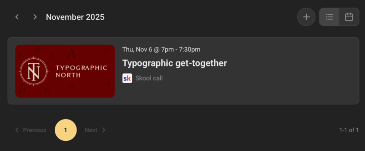
Introducing: The calendar
Finally! The calendar is now available in the community. And with it, you'll find our first-ever Typographic get-together on Thursday, 6 November. It will be our first live call in this community, and you're very welcome to join. We have no agenda, just offering a place to hang out and talk – also probably about things related to typography and design :-) Come hang out and say hello! Find the event in the calendar. You can also add it to your own calendar from there.
2 likes • Oct '25
This is terrific, @Kris Hus! I'm not sure I can make it next week, but I'll try.

Oct '25 •
Hey, I'm Erick 👋
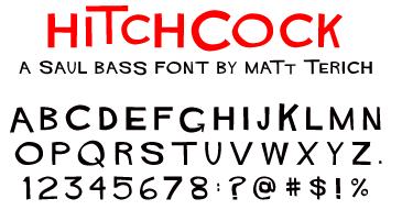
Hello, I'm Erick, a graphic designer from California living in Italy. I've been a graphic designer for about 10+ years. Let's break that down: I started as a novice graphic designer in high school, a few months before graduating high school I started a freelance business and worked as a freelance designer and video editor. Went to school for Graphic Design, received a degree in 2018, and now I'm working for a start-up where I've been working as the creative director for about 5 years. My favorite font is Hitchcock, which is reminiscent of the golden age of film era when Saul Bass, my favorite graphic designer, was in his prime. My favorite typeface is a trickier answer, but Futura/Helvetica are some of my favorites.
3 likes • Oct '25
Welcome, @Erick Aroldo! What an amazing 10 years it's been for you! What's next?
1 like • Oct '25
@Erick Aroldo hope that things go extremely smoothly as you work to bring your plans into the real world!
🔥
Oct '25 •
Some definitions
Hello, explorers! I've added a page to the introductory course in the classroom, where I try to define what we're building in this group. It goes something like this: Typography is the art and craft of arranging text so that it reads well. It's part functionality and part aesthetics. When you read a text, you don't want any unnecessary friction; you want to move through the text with your eyes quickly and get the message. Whether it's a sign at the airport directing you towards your gate, or a classical novel you're reading. When it works well, you don't notice it. It's invisible. But when you turn the page and can't find out where to read next, something is missing. When you have to squint your eyes to read the back of the bottle, the text is too small, or too tight, or the colours lack contrast. Typefaces can also express emotions and style. There's a stark contrast between a typical wedding invitation and a typical subway billboard. Typography encompasses all the small details on the page, on the screen, or on a sign. Text is everywhere, and a typographer makes sure it's readable and feels right. The content in this group is related to all these things, and more. We look at typefaces, line spacing, kerning, the contrast between the headings and the body text, where to put page numbers and how to format a good bullet list. Sometimes we go overboard and move into graphic design, or web design, or photography, illustration and film editing. But the common denominator is the text. What we discuss here can be useful for anyone who designs with text. Or writes. And that is almost everyone. Another central part of the content here will be tackling long-form publications. Books, magazines, long websites, multi-page documents. These have another dimension to them when it comes to text flow. Not only are we looking at the text on one side of a business card, but we’re thinking about how the text moves from page to page. When we insert a photo on one page, the text jumps further down the following page. If we increase the font size, the document needs more pages to contain the text.
2 likes • Oct '25
@Kris Hus, this looks like a terrific introduction to what you're aiming for and a fantastic mission statement! Is it close to what you were thinking when you launched the group or has it changed a lot as people have interacted with your posts?
1 like • Oct '25
@Kris Hus, it's super interesting to watch how you are feeling your way forward and learning as you go! Thank you for sharing the journey and your knowledge!
Sep '25 •
Hello!
I'm Wesley. I have a longstanding love-affair with books, but less with type, so I thought I'd join you to see if I could get some education on the topic. My favourite font is Papyrus. I would never use it, but there's something that resonates deeply with me. The writing I self-publish is all written in Markdown, translated to LaTeX and then compiled. Purists will probably be horrified, but I find it easy to get above average results with very close to no time spent on formatting.

0 likes • Oct '25
Hi @Angie Thomas
1 like • Oct '25
@Angie Thomas, this is a good place to start https://www.skool.com/typographicnorth/classroom/1a2c0114?md=78d1328ac8e94a29bacbc55f93460cc8 It will probably raise questions, which you can get answered by posting them in the Community section. Best of luck!
1-10 of 10

@wesley-penner-9119
A curious fellow, constantly being curious. Exec skills start with productivity and flow to personal offers.
Active 9h ago
Joined Sep 30, 2025
Powered by