Activity
Mon
Wed
Fri
Sun
Aug
Sep
Oct
Nov
Dec
Jan
Feb
Mar
Apr
May
Jun
What is this?
Less
More
Memberships
Start Writing Online
20.9k members • Free
Copywriting 101
2.4k members • $37
Writers 2 Authors
297 members • $4/month
Kidlit Author Growth Academy
1.1k members • Free
Writers Block
611 members • Free
Entrepreneur to Author
272 members • Free
PublishingOS (Free)
14.4k members • Free
Happily Ever Authors (Free)
2.2k members • Free
Story Hacker STARTER
7.6k members • $7
3 contributions to Kidlit Author Growth Academy
Nov '25 •
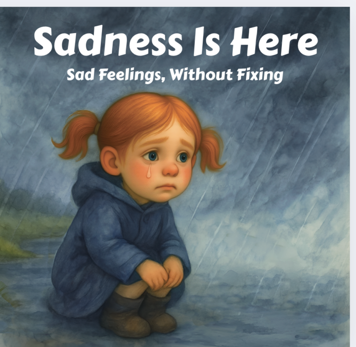
Advice on Font Style and Color for Children's Book on Sadness
Hi everyone! I’d love some advice on font choices for my book. I’m attaching the title page and a few of the inside pages — the illustrations were done by an illustrator, but I’m not sure what font style, layout, or color would work best with them. Any suggestions and ideas would be appreciated. Thanks!

0 likes • Nov '25
Hi Karrie!Your illustrations are lovely and full of emotion. As a fellow author, I really appreciate how you’re exploring sadness in a way that feels gentle and safe for children. The cover font you have now is clear and readable, which is great for thumbnails, but it doesn’t fully capture the feeling your story already holds. You might look for something that feels softer and more personal, like a font that looks slightly handwritten or rounded. Fonts such as Patrick Hand, Fredoka, or Comfortaa could keep that warmth while staying readable. For color, a muted blue, lilac, or even a warm cream tone would blend beautifully with your artwork. Those tones help the title feel calm and comforting instead of heavy. Small changes in word size or placement can also make the title flow with the illustration rather than sit on top of it. If you’d like, I can show you a few examples or mock-ups that match your story’s tone. You’ve built something really heartfelt, and with the right typography, it can speak to children and parents before they even turn the first page.

Oct '25 •
Hi fellow authors
I'm here to make friendship with all fellows authors that's in this group for more to know about your books and to share tips together anyone who's available
0 likes • Oct '25
Have you published before
0 likes • Oct '25
@Deb Hockenberry That is awesome 😎
Oct '25 •
Introduction
I’m Victoria David, a new author who just joined Skool. I’m passionate about storytelling and love connecting with creative, like-minded people. I’m excited to learn, grow, and share ideas with this amazing community. Looking forward to meeting new people and being inspired by your journeys!
0 likes • Oct '25
@Monica Layne Thank you Monica
0 likes • Oct '25
@Harleigh Manske Thank you Harleigh
1-3 of 3

Active 3d ago
Joined Oct 20, 2025
ESFP
America/ New York
Powered by