Activity
Mon
Wed
Fri
Sun
Aug
Sep
Oct
Nov
Dec
Jan
Feb
Mar
Apr
May
Jun
Jul
What is this?
Less
More
Owned by Sandi
Its Important for sensory play because it engages all of a childs senses taste,touch,smell,sight,hearing & has a positive impact on brain development.
Memberships
The Mompreneur Club 🌸
903 members • $19/month
Soul Art Journey
136 members • Free
The Wheel of Life Lab
74 members • Free
GroupEx Martial Arts
36 members • Free
Gentle Self-Care Creatives
51 members • Free
What Is Skool?
1.1k members • Free
GroupEx Fitness & Flexibility
43 members • Free
DIY Gardening
1.1k members • Free
Sales Training & Placement
8.1k members • $27/month
2 contributions to Mixed Media ART CLUB

Jan 25 •
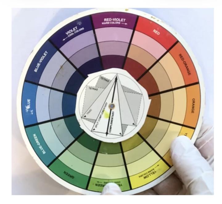
The Colour Wheel (from someone who never uses it! 🤪)
Let’s talk about the colour wheel! 🎨 It’s one of those classic art tools we all learned about at some point, primary, secondary, complementary colours, and all those cute little slices of the rainbow. I’ll be honest: I almost never use it when I’m creating. My process is much more about intuition, play, and seeing what happens when I mix and match colours on the fly. But here’s the thing: even if I don’t pull out a colour wheel, I do think it’s a brilliant tool for understanding how colours can work together (or clash in the most interesting ways!). If you’re ever feeling stuck or want to try something new, spinning the wheel can spark ideas you might not have considered, like pairing opposites for bold contrast or choosing analogous colours for a softer, harmonious vibe. So, while I might not use the colour wheel in my day-to-day art-making, I love that it’s there as a guide for anyone who wants a little extra confidence or inspiration with colour choices. And sometimes, just knowing the “rules” makes it even more fun to break them! Do you use the colour wheel in your art, or do you prefer to trust your instincts? I’d love to hear how you approach colour in your own creative process!

1 like • Jan 25
Orange is NOT in my color wheel lol
Jan 6 •
WELCOME LOVELY ARTY PEOPLE!
Welcome to ART CLUB!!! I'm sooooo excited to be starting this new club. Please introduce yourselves and share a pic of one of your creations if you like. Don't by shy, we're all lovely arty people here who love seeing all levels and types of arty stuff. 😍
3 likes • Jan 25
Hello everyone! New to the group! My name is Sandi. My skool is about teaching moms how to create sensory activities and bins for our growing toddlers!
2 likes • Jan 25
@Caroline Turner thank you so much !!!
1-2 of 2
@sandi-burrage-4591
Just a Mom doing mom things Showing other mommas how to Make & create sensory activities and bins for our growing toddlers! Teaching fine motor skills
Active 161d ago
Joined Jan 25, 2026
Michigan