Activity
Mon
Wed
Fri
Sun
Sep
Oct
Nov
Dec
Jan
Feb
Mar
Apr
May
Jun
Jul
What is this?
Less
More
Memberships
Maker School: AI Automation
2.3k members • $184/m
AI Automation Society
432.7k members • Free
The 4 Hour Consultant
1.1k members • Free
AI Automation Agency Hub
331k members • Free
Funnels University
1.1k members • Free
Selling Online / Prime Mover
36.7k members • Free
Agency Coach Community
4.7k members • Free
Scale It Up
123 members • Free
Imperium Academy™
72.1k members • Free
16 contributions to Selling Online / Prime Mover

Jun 21 •
DAY 10/30 – Funnel Redesign Challenge
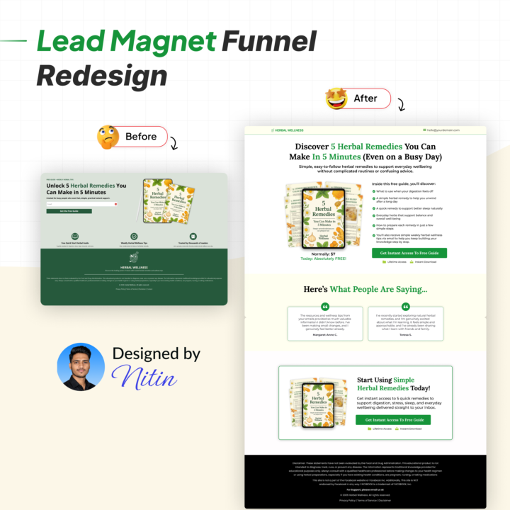
Today, I redesigned a Lead Magnet Funnel for a Herbal Wellness business. And after reviewing the page, I noticed something important... The lead magnet itself was good, but the page wasn't creating enough curiosity or perceived value for visitors to feel compelled to opt in. The original page was very minimal. There wasn't enough copy to communicate the value of the guide, no testimonials to build trust, and the lead magnet itself didn't feel as valuable as it could have. In a lead magnet funnel, people are making a simple decision: "Is this resource worth giving my email address for?" If the answer isn't obvious within a few seconds, conversions suffer. So I redesigned the funnel to increase perceived value, build trust, and make the guide feel like something people genuinely want to download. Here's what I changed 👇 𝐁𝐄𝐅𝐎𝐑𝐄: ❌ The headline focused more on the guide than the outcome readers would get ❌ Very little copy explaining the benefits of downloading the resource ❌ No testimonials or social proof to build trust ❌ The lead magnet wasn't positioned as a high-value resource ❌ No supporting sections reinforcing why visitors should opt in ❌ The page felt more like a simple opt-in form than a conversion-focused lead magnet funnel 𝐀𝐅𝐓𝐄𝐑: ✅ Rewrote the headline and subheadline to focus on the result, transformation, and benefits of the guide ✅ Added benefit-driven bullet points showing exactly what readers will learn ✅ Created a stronger lead magnet mockup to increase perceived value ✅ Added testimonials to build trust and credibility ✅ Added supporting sections that reinforce the value of the guide ✅ Improved the page structure and visual hierarchy to make the offer easier to understand ✅ Enhanced the overall branding and user experience to increase conversions 𝐖𝐇𝐘 𝐓𝐇𝐈𝐒 𝐌𝐀𝐓𝐓𝐄𝐑𝐒: Lead magnet funnels have one primary goal: Create enough curiosity and perceived value that visitors willingly exchange their email address for your resource.
1 like • Jun 26
@Steve Flores Thanks ☺️
1 like • Jul 2
@John Steggell Thanks 😊
Jun 25 •
DAY 11/30 – Funnel Redesign Challenge
Today, I redesigned a Tripwire Funnel for a Herbal Wellness business. After reviewing the funnel, one thing stood out immediately... The page looked like it had been generated by AI. While the structure was technically there, it lacked the strategy, personality, and persuasion needed to convince someone to spend even $9. That's the biggest misconception about low-ticket funnels. People assume that because the price is low, people will buy automatically. In reality, visitors still need to trust you before they pull out their credit card. So I redesigned the funnel to increase perceived value, build trust, and make the $9 offer feel like an easy "yes." Here's what I changed 👇 𝐁𝐄𝐅𝐎𝐑𝐄: ❌ The page looked generic and AI-generated with very little brand personality ❌ The headline focused on the product instead of the transformation it delivers ❌ Very little storytelling or emotional connection with the audience ❌ The offer felt like a digital PDF instead of a valuable solution ❌ The page didn't create enough perceived value before introducing the price ❌ Limited trust-building elements before asking for the purchase 𝐀𝐅𝐓𝐄𝐑: ✅ Rewrote the headline and subheadline to focus on the outcome rather than the product ✅ Created a premium product mockup to increase perceived value ✅ Added benefit-driven sections explaining why the playbook is valuable ✅ Compared life with and without the playbook to help visitors visualize the transformation ✅ Introduced problem-awareness sections so visitors immediately relate to the offer ✅ Improved the page flow to build desire before presenting the price ✅ Redesigned the entire funnel to feel more premium, trustworthy, and aligned with the brand 𝐖𝐇𝐘 𝐓𝐇𝐈𝐒 𝐌𝐀𝐓𝐓𝐄𝐑𝐒: Low-ticket funnels aren't about selling a cheap product... They're about creating an easy first "yes." When someone buys your $9 offer, they're not just buying a playbook. They're buying their first experience with your brand. That's why every tripwire funnel should focus on:

Jun 13 •
DAY 8/30 – Funnel Redesign Challenge
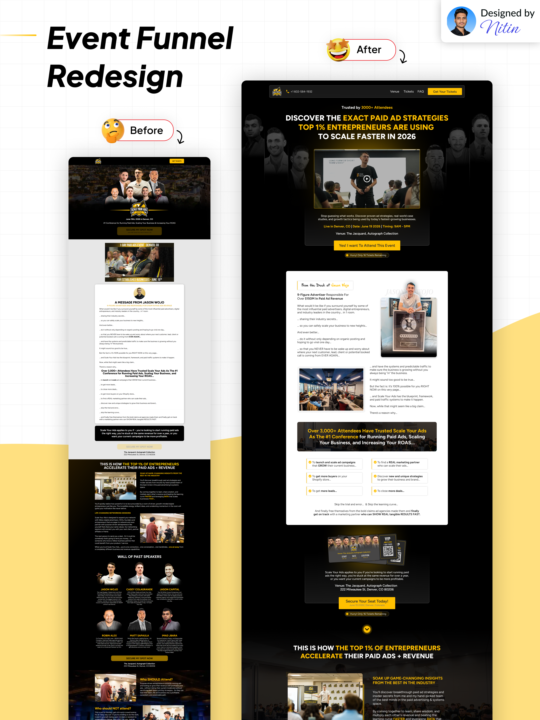
Today, I redesigned an Event Funnel for a marketing agency. And after reviewing the page, I noticed something interesting... The agency was clearly doing great work, but the funnel wasn't reflecting the level of authority and credibility they had built in the market. This is a company that has earned both the 2CC and 10CC Awards, helped countless businesses scale, and generated incredible results for clients... Yet the event funnel wasn't showcasing that authority in a way that immediately built trust or increased the perceived value of the event. So I redesigned the funnel to increase perceived value, strengthen positioning, position the event as a premium experience, and make the ticket feel like a no-brainer investment. Here's what I changed 👇 𝐁𝐄𝐅𝐎𝐑𝐄: ❌ The branding and overall presentation didn't feel aligned with a company that has earned 2CC and 10CC Awards ❌ No strong headline or subheadline above the fold to communicate the value of attending ❌ No clear urgency or scarcity elements encouraging visitors to take action now ❌ Limited trust signals showing how many clients they've helped or previous event success ❌ The event offer wasn't positioned strongly enough above the fold ❌ The experience felt more like a standard workshop than a premium event ❌ The CTA wasn't prominent enough to drive registrations 𝐀𝐅𝐓𝐄𝐑: ✅ Rebuilt the funnel to create a premium event experience and increase perceived value ✅ Added a stronger headline and subheadline focused on the outcome attendees want ✅ Improved the positioning of the event to make it feel exclusive and high-value ✅ Added stronger authority and credibility elements throughout the funnel ✅ Added an event ticket design to make the event feel more real, tangible, and legitimate ✅ Introduced additional trust-building elements to reinforce credibility ✅ Added a phone number in the header, creating another path for prospects to get information about the event (and providing an opportunity to use an AI voice agent to answer questions 24/7)
2 likes • Jun 15
@DrBetsy Meshbesher good guess! 😄 You're right, I'm from India. Great connecting with you here as well!
0 likes • Jun 19
@Reetesh Bhardwaj Thanks 😊
Jun 18 •
DAY 9/30 – Funnel Redesign Challenge
Today, I redesigned a Course Funnel for a Nail & Brow Academy. And after reviewing the funnel, I noticed something that I see quite often with education-based businesses... The academy had the experience, the student results, and the training system... But the funnel wasn't positioning the program in a way that made enrolling feel like the obvious next step. In industries like beauty, certification, and skills-based training, people aren't just buying a course. They're investing in a new career, a new income stream, and a new future. So the funnel needs to sell that transformation. Here's what I changed 👇 𝐁𝐄𝐅𝐎𝐑𝐄: ❌ The offer wasn't clearly positioned around the career outcome that students could achieve ❌ There was no strong value proposition above the fold ❌ Student success and credibility weren't showcased early enough ❌ The training process wasn't clearly explained, creating uncertainty around what happens after enrollment ❌ The page felt more like a website than a structured enrollment funnel ❌ The academy's expertise and years of experience weren't being leveraged effectively 𝐀𝐅𝐓𝐄𝐑: ✅ Repositioned the offer around the transformation students want, building a successful Nail & Brow career ✅ Added a stronger headline and subheadline focused on outcomes rather than features ✅ Introduced credibility and authority metrics directly in the hero section ✅ Added a step-by-step framework showing exactly how students progress through the program ✅ Made the learning journey easier to understand and visualize ✅ Added stronger social proof and student success stories throughout the funnel ✅ Improved the page structure, readability, and user experience to make the content easier to consume ✅ Redesigned the funnel to feel more premium, professional, and aligned with a leading academy 𝐖𝐇𝐘 𝐓𝐇𝐈𝐒 𝐌𝐀𝐓𝐓𝐄𝐑𝐒: Course funnels are different from lead generation funnels or webinar funnels. People aren't just asking:
3
0

May 27 •
DAY 3/30 – Funnel Redesign Challenge
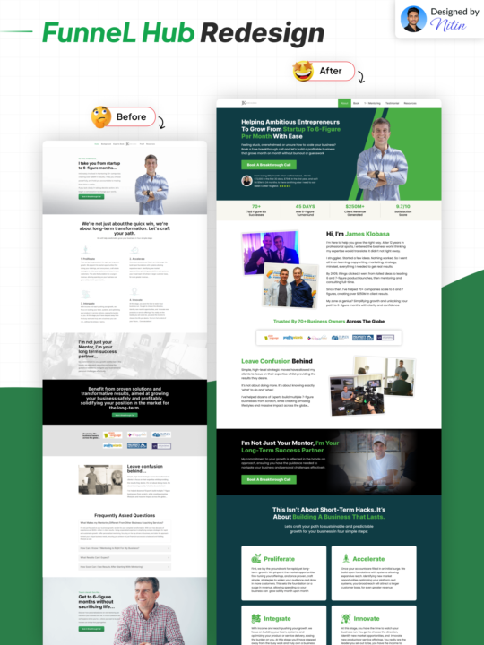
Today, I redesigned a Funnel Hub for a business growth coach. . The original page had valuable information…. . But it wasn’t structured in a way that immediately built trust, communicated the offer clearly, or guided visitors toward taking action.. . So I redesigned the funnel to make it cleaner, more strategic, and conversion-focused. . Here’s what I changed 👇 . 𝐁𝐄𝐅𝐎𝐑𝐄: . ❌ Weak visual hierarchy and unclear messaging . ❌ No strong “above the fold” section to grab attention instantly . ❌ Important information felt scattered and harder to scan . ❌ Minimal trust-building elements near the top of the page . ❌ CTA buttons didn’t stand out enough . ❌ The overall design felt outdated and less engaging . 𝐀𝐅𝐓𝐄𝐑: . ✅ Added a stronger headline focused on the desired outcome . ✅ Created a cleaner hero section with a more modern layout . ✅ Improved spacing, structure, and readability across the page . ✅ Added stronger social proof and credibility elements . ✅ Made CTA buttons more visible and action-oriented . ✅ Reorganized sections to guide visitors naturally through the funnel . ✅ Upgraded the overall branding and design to feel more premium and trustworthy . 𝐖𝐇𝐘 𝐓𝐇𝐈𝐒 𝐌𝐀𝐓𝐓𝐄𝐑𝐒: . Most visitors decide within seconds whether they trust your business or leave your page. . If your funnel feels confusing, cluttered, or unclear… . You lose potential leads before they even understand your offer. . A well-structured Funnel Hub helps visitors: . - Understand what you do quickly - Trust your brand faster - Stay engaged longer - Take action with confidence . Because great funnels don’t just “look better.” . They guide people toward becoming clients. . Would love to hear your thoughts on this redesign 👇 . Cheers, Nitin
2 likes • May 27
@Ryan Swayt the most important things to tweak in terms of funnel design is visual hierarchy making the important things stand out clearly... like the headline, sub headline or CTA button. It’s done using the right size, colors, spacing, contrast, and layout.
1 like • Jun 14
@DrBetsy Meshbesher
1-10 of 16

@nitin-vishwakarma-1548
I help people build conversion-focused funnels in 14 days that turn traffic into paying clients and customers on autopilot 24/7! 🚀
Active 11d ago
Joined Nov 4, 2024
Powered by