Activity
Mon
Wed
Fri
Sun
Sep
Oct
Nov
Dec
Jan
Feb
Mar
Apr
May
Jun
Jul
What is this?
Less
More
Memberships
In-House Edge Community
91 members • $99/month
11 contributions to In-House Edge Community

Dec '25 •
Facebook...
So... I want to find a clear link to my brand new Facebook page to send to people who are currently not FB friends, so they can like/follow me (other networks), but I can'f find my own FB page! How frustrating. Do I need a number of followers for others to find me? Here's a link: https://www.facebook.com/profile.php?id=61584732796951#

Nov '25 •
Sharing possibilities with AI videos
Hi everyone. I am looking forward to our next session to get our 'voice' in Chat GPT. My awesome VA has been attending the AI conference and I suggested she pick a few things we might try out to make our lives easier. Currently, it takes ages for me to record and then edit and mess around figuring out things and then my screen freezes or the cat jumps up on the keyboard. She had a go at two AI generated 'Claires'. OK... I sound as if I am 12 years old in one of them and definitely have changed nationality to American. But if I could get a voice that worked then I can set up info Chat GPT generated, and let people know it is AI generated... etc. Have a listen to the first two ever attempts at AI video generated from my website photo. The hands even move!

1 like • Nov '25
Wonder if you can train the hands too 😂
Oct '25 •
New website…
It’s finally live on the new platform. Still a lot of rewriting and tweaking to be done, but here it is: https://www.eaglevisioncoachingandtraining.com/
0 likes • Oct '25
@Hannah Presswood yeah, that’s probably what it will be. For now I’ve left it the way the template was. Lots to do still.😊
0 likes • Nov '25
@Matt Earle thank you ☺️
Oct '25 •
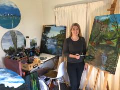
Lead Magnet - Gift Giving Guide
Let me know what you think of this lead magnet - I've made amendments as per Hermozi with the corresponding landing page.
0 likes • Oct '25
I enjoyed reading and looking at your lead magnet. What beautiful artwork! Stunning! I wanted to know what the medium was (at the beginning), as that adds value in my thinking, while I'm looking. The first page was a bit difficult to read I thought, the letters are a bit close together, and the text over the paintings is also a bit hard to read. Love how you've given each artwork its own space, like a mini gallery; they really breathe beautifully, and the mockups really show them off. On the first page, though, having them all side by side under the same title almost feels disrespectful, or diminishing them; they're each so beautiful that it didn't feel right. You stamp with signature makes it look very sophisticated and boutique, I'd give it more space. It's a beautiful document, I could look at this again and again, shall I buy? I could be tempted.

Sep '25 •
Email Marketing Workshop
Alrighty – the votes are in! Our first workshop (early Oct, date TBC) will be on Email Marketing. For those who voted on other topics, don’t worry — we’ll cover everything in good time. Now, to make this session super useful:What are your biggest email marketing hiccups right now? - Tech setup and automations - Coming up with story ideas - Writing emails people actually open and click - Growing your list - Segmenting or tagging properly - Not knowing what to send (and how often) - Staying consistent - Turning subscribers into actual customers Drop your pain points below so we can build the workshop around what you need most. Most people massively underutilise their email list so it's a great weapon to master.
0 likes • Oct '25
@Kirsten McIntosh I see! Thanks for investigating! We'll have a look at that.
0 likes • Oct '25
@Sue Knowles I’m just swapping Wix for Wordpress, for both systems you need a plugin like mailchimp or something similar.
1-10 of 11
@mathilde-noordzij-1173
Coaching villages around medically complex children so families feel supported, connected & able to thrive.
Active 14d ago
Joined Sep 15, 2025
ENFJ
Auckland, New Zealand
Powered by