Activity
Mon
Wed
Fri
Sun
Jul
Aug
Sep
Oct
Nov
Dec
Jan
Feb
Mar
Apr
May
Jun
What is this?
Less
More
Owned by Kyle
Free AI writing studio for creators, ghostwriters, & brand specialists building client-ready content systems. Make your first $100K writing with AI!
Helping ANYONE break into IT and become a Tech Elite leader - Regardless of background. Because if I can do it, so can you!
Memberships
People of Health
197 members • Free
Ghostwriters Anonymous
16.9k members • Free
PGA (Course Only)
2.2k members • Free
Kourse (Free)
112.4k members • Free
Scaling with Skool
1.2k members • Free
22 contributions to $100K AI Writing Lab (FREE)

Apr 16 •
Throw Down Thursday Post 🔥
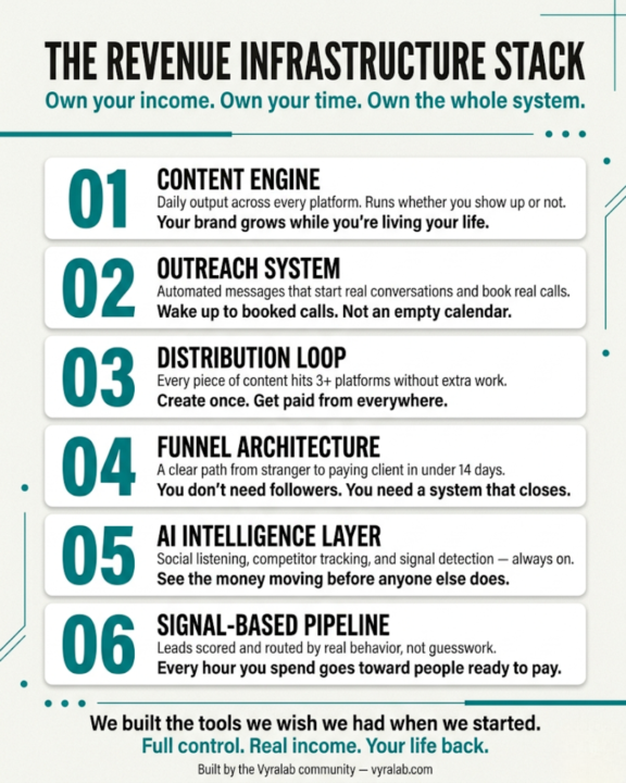
Traditional branding agencies charging $10K+ for a logo, color palette, and "brand voice doc" are running a 2014 scam in 2026. And they're counting on people like us not talking about it. Here's what they sell: You pay $10K-$25K. You wait 6-8 weeks. You get a PDF with your hex codes, 3 font pairings, a logo in 47 file formats you'll never use, and a "brand voice guide" that says things like "Our tone is professional yet approachable." That and $6 gets you a coffee. Here's what we know that they don't want people to figure out: → A content engine that runs daily without touching it → An outreach system that books calls while you sleep → A funnel that turns strangers into clients in under 14 days → A distribution loop that puts you in front of buyers — not "audiences," buyers They charge $10K+ for a Canva-tier deliverable. We build revenue infrastructure for sweat equity. Collectively, this community has touched hundreds of millions in revenue. Nobody in here closed a deal because of a hex code. Nobody landed a retainer because of a mood board. We don't do aesthetics-first. We do infrastructure-first. So let's make it official. We put together a cheat sheet — "The Revenue Infrastructure Stack" — that breaks down exactly what we build instead of what they sell. The stuff agencies won't teach because if their clients knew it, they'd never write that check again.
1
0
Apr 11 •
🚨📢 NEW Automated OUTREACH PLATFORM (Coming [Very] Soon!)
Pics or It Didn't Happen 📸 Saturday. No frameworks. No theory. Just proof. Drop a screenshot from your week. A win. A loss. A weird DM. A dashboard. An outreach reply that made you laugh. Something real. I'll go first. I've been building something called VyraReach — an automated outreach system designed for solo operators who don't have a sales team and don't want to need one. Screenshots below of what it looks like on the inside. This isn't a mockup. This isn't a landing page render. This is the actual tool, running actual outreach, right now. No VA. No agency. No $500/month software stack duct-taped together. More coming soon on this. If you want early access when it drops, comment "REACH" below and I'll put you on the list. Now your turn. Show me something real from your week. (Receipts only)
1
0
![🚨📢 NEW Automated OUTREACH PLATFORM (Coming [Very] Soon!)](https://assets.skool.com/f/d97383c06078408990022e220ef40581/6908bb29c7734d2ebdcb3c222134826e2dabf234d5cd49e0bcb3ab9d103ca487-md.png)
Apr 2 •
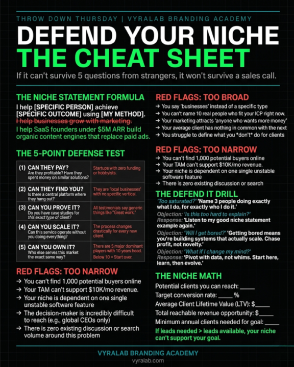
🔥 THROW DOWN THURSDAY: "What's Your Niche? Defend It."
Here's how this works. Drop your niche in ONE sentence in the comments. Not a paragraph. Not a manifesto. One line. Then everyone else's job is to tear it apart. Too broad? Call it out. Too saturated? Say it. No money in it? Be honest. This isn't about being nice. This is about getting sharp. Because if you can't defend your niche against 20 people in a Skool community, you definitely can't defend it to a prospect who's about to hand you money. Rules: → One sentence. That's it. → If you're poking holes, be specific. "It's too broad" isn't helpful. Tell them WHY. → If your niche survives the gauntlet, you're sitting on something real. → If it doesn't — good. Better to find out here than after you've built an entire business around it. Go.
1
0
Apr 1 •
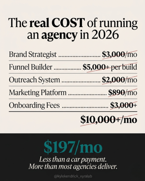
⚡ Wired In Wednesday: Your Agency Bill vs. Your Car Payment
Let's do some math that should make you uncomfortable. If you wanted to hire an agency to handle your brand strategy, build your funnels, run your outreach, and give you ongoing strategic guidance — here's what that actually costs in 2026. A brand strategist charges $50-$300 an hour as a freelancer. At an agency, that jumps to $150-$500 an hour. Even at the low end, 10 hours of strategy work a month is $500-$3,000 — and 10 hours barely scratches the surface of what a real brand strategy requires. A marketing agency retainer for a small business runs $3,000-$7,000 a month. That's the range where you start getting a dedicated account manager, custom strategy, and 20-40 hours of actual work. Below that? You're getting junior staff running templates. Need funnels built? A freelance funnel builder on Upwork or ClickFunnels marketplace charges $5,000-$15,000 per project. And that's just the build — not the ongoing optimization. Need outreach handled? Email and LinkedIn outreach services run $1,000-$3,000 a month on top of everything else. Add it all up and a solo operator trying to get brand strategy, funnel building, automated outreach, and real strategic guidance is looking at $5,000-$10,000 a month. Minimum. And that's before you factor in the mandatory onboarding fees — HubSpot alone charges $3,000 just to get you set up on their Marketing Pro plan. Now here's the number that matters: The average car payment in the US right now is $767 a month for a new car. $537 for used. Those numbers come straight from Experian's Q4 2025 report. Vyralab gives you the brand strategy engine, the AI funnel builder, the automated outreach system, and an AI intelligence layer that actually knows your account data — all for less than a used car payment. Not a stripped-down version. Not a "starter" tier with the good features locked behind an upgrade. The whole system. The old model wanted you to pay agency prices or cobble together six different tools with six different logins and six different bills. The new model puts all of it in one place, built to work together, for less than what most people pay to park a depreciating asset in their driveway.
1
0
Mar 31 •
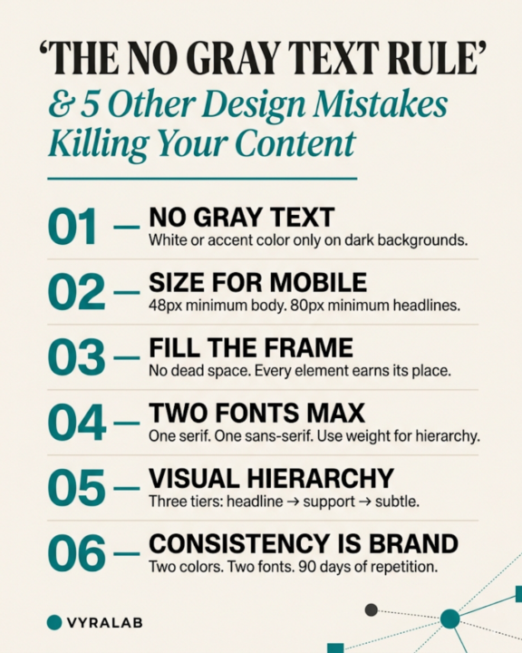
🎓 Tutorial Tuesday: The "No Gray Text" Rule and 5 Other Design Mistakes Killing Your Content
You could have the best copy on the internet and it won't matter if nobody can read it. Most solo operators are making the same 6 design mistakes on every piece of content they post. I know because I made all of them. Here's what they are and exactly how to fix each one. Mistake #1: Gray text on dark backgrounds. This is the one I see everywhere. Light gray text (#999 or #AAAAAA) on a dark background. It looks "aesthetic" on your monitor. On someone's phone at 40% brightness on a sunny sidewalk, it's invisible. The fix: White (#FFFFFF) or your accent color. That's it. Those are your two options for text on dark backgrounds. If you're squinting, your audience already scrolled past. Mistake #2: Text that's too small for mobile. Your content lives on a phone screen. Not your 27-inch monitor. Not your MacBook. A 6-inch rectangle people are holding while they walk. The fix: Body text should never go below 48px in your design file for a 1080x1920 canvas. Headlines should be 80px minimum. If it doesn't look almost comically large in your editor, it's too small on a phone. Mistake #3: Dead space everywhere. Negative space is a design principle. Dead space is a design failure. There's a difference. If your graphic has a line of text floating in the center of a 1080x1920 canvas with nothing else going on — that's not minimalism. That's an unfinished post. The fix: Fill the frame. Use background textures, secondary text elements, accent lines, visual hierarchy. Every piece of your canvas should be earning its space. Look at any post from @therishishine — there is no wasted real estate. That's intentional. Mistake #4: Using more than 2 fonts. Every time you add a third font, your design gets 50% harder to look at. Mixing script fonts with sans-serif with slab serif because you saw a Canva template do it doesn't make your content look premium. It makes it look like a ransom note. The fix: One serif. One sans-serif. That's your whole system. Use weight (bold, medium, light) and size to create hierarchy instead of reaching for another font. Pair something clean and modern for body text with something with more personality for headlines. Then stop.
1
0
1-10 of 22

@kyle-kendrick-5539
Certified Project Manager 10+ years | PhD Candidate in I/O Psych | Writer | Researcher | Scientist | Baseball Fanatic
Active 12d ago
Joined Feb 16, 2026
INTJ
Oklahoma