Activity
Mon
Wed
Fri
Sun
Sep
Oct
Nov
Dec
Jan
Feb
Mar
Apr
May
Jun
Jul
What is this?
Less
More
Memberships
Creative AF Club
152 members • Free
Whimsykel Retailers Hub
31 members • Free
1 contribution to Creative AF Club

🔥
27d •
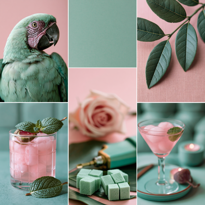
🎨 Moodboard Monday | Mint Green with Pops of Pink
This week's moodboard is a little different. I came across this brightly colored parrot on Pinterest and started playing with his colors in Photoshop. After a little experimenting, I landed on this soft mint green and blush pink palette and immediately thought, "Now that's interesting." Next, I adjusted the leaves to match the same vibe, then searched Pinterest for a few more images that fit the palette. Before long, this entire moodboard came together. One thing I love doing is shifting the colors of existing images in Photoshop or Canva. It can completely change the mood of a photo and spark color combinations you probably wouldn't have considered otherwise. It's a great creative exercise when you're feeling stuck. Now tell me... why does this moodboard make me crave a Cosmopolitan and mint chocolate chip ice cream at the same time? 😂 One of my favorite Pinterest features right now is Collages. You can pull elements from different Pins, arrange them into your own moodboard, and even share it as a post. It's a fun way to experiment with color, texture, and style without needing any fancy design skills. Just one warning... set aside a little extra time before you start. Pinterest has a funny way of turning a five-minute idea into an hour-long creative rabbit hole. How would you use this color combination? Would you lean into a retro diner vibe with black and white? Maybe a coastal cottage, a glam bedroom, or a painted furniture piece? I'd love to hear where this palette takes you. 💚🩷
6 likes • 27d
Love those colors together! Leaning towards antique vibe with florals
1-1 of 1
Active 27d ago
Joined Feb 1, 2026
Powered by