Activity
Mon
Wed
Fri
Sun
Jun
Jul
Aug
Sep
Oct
Nov
Dec
Jan
Feb
Mar
Apr
What is this?
Less
More
Owned by James
Post your art here for deep feedback from me and your fellow artists.
Memberships
2D Digital Artist Community
22 members • Free
5 contributions to Dilettante Helps YOU Make Art
Nov '25 •
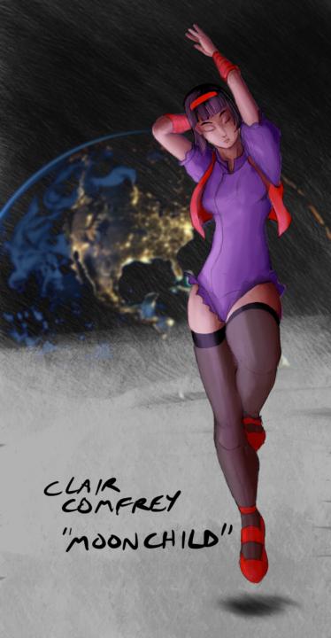
Pic four, Clair from Brooklyn's Last Light!
Here's my latest, my BLL character Clair! Crits invited, I'll write some myself when I take another look in a day or two with fresh eyes. I wish you could adjust these thumbnails...
1
0
Nov '25 •
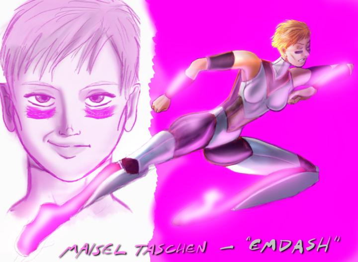
Drawing 3!
This is the third of my Brooklyn's Last Light characters, Maisel Taschen, or "Emdash".
0 likes • Nov '25
I've never been sure about back anatomy, and I think her back should probably be more superheroic and muscular (although I'm not married to the idea of "heroic proportions", the whole ten-heads-high thing, I do think elements of the ideal work for certain, more muscular or imposing characters, and Maisel is meant to be hard as nails. My main self-criticism here is that her ribcage, the upper back/chest area isn't developed enough, she's too skinny. I also need to work on making her more obviously muscular and angular, as her limbs look too "normal" the way I draw them, I find it difficult to impose muscular definition without just making limbs wider. I like the glow on her forearms and boots when she runs, because it's meant to look like a drunken blast in a Lamborghini down the Las Vegas strip when she's using her powers, butt perhaps the glow is too "clean", not sparky enough like the lighting effects they do for the Flash, and it could be too pink rather than the red shade that the glowing parts show when she's not running. I've obviously got a lot of work ahead of me, even when the overall impression is pretty good. Any tips on perfecting this?
Nov '25 •
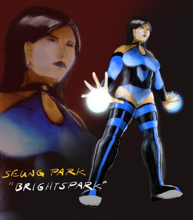
Drawing number two!
This is Seung Park, the electricity-wielding lady known, not sarcastically at all, as "Brightspark"! It's a pun on her name, do you know how long it took me to find a Korean girls' name beginning with S? And it's a unisex name that mostly isn't given to girls, I'm told! Well that's fine, I like the name Seung.
0 likes • Nov '25
In some ways this is pretty "together". I wanted to sell Seung's solidity, as she's meant to be a big girl restrained by a corset, which can be a difficult thing to draw correctly. If anyone has any tips on getting thiccness across while still being contained in a corset, I'd love to hear it. The biggest problem is her face, because everyone notices when you get a face wrong. The angle of her facial features is at odds with her skull; the nose needs to be further rightwards, the eyes need to be depicted at a steeper angle, and the mouth... Well, the mouth is fine, right? I'm proud of the chunky thigh -high goth boots, and I don't mind that I forgot to do any rendering on her soles (you shouldn't be able to see them, after all!), but her feet aren't aligned right - her left leg is fine, but her right should be pointing closer to the camera. I should've used Procreate's perspective drawing guide! Well, live and learn. My lighting is getting better with this one, with her shiny black and matte-ish blue. I think I lit her jaw and face well. Any tips, readers?
Nov '25 •
Drawing number 1!
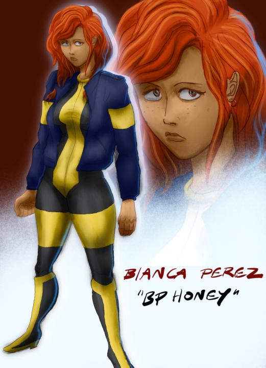
To kick this group off, I'm going to post three recent works of mine with noticeable flaws, and give myself "feedback" with a fresh eye. These are all promo images from my upcoming webcomic, BROOKLYN'S LAST LIGHT. No, I will not generally be promoting it here, is just that all my recent art has been BLL-related! First up, there's the character of Bianca Perez, or BP Honey, whose name came to me in a dream!
0 likes • Nov '25
Okay, let's start at the top, with the hair! BP's hair has a lot of body, and I think I picked good colours, but the body thing is flawed, because such thick hair shouldn't be so easily contained by her jacket collar. It mars the general shape of the hair, and makes it look thinner and lighter than it should be. Moving down, I think the point of her chin is misplaced, because she meant to have quite a strong chin, and placing the point so far rightwards of the mouth makes it look like her chin is weak and recessed. The tip of the chin should be directly below the mouth. Seems obvious, but when you're conscious of drawing the curvature of the head at a 3/4 angle, you can make mistakes like that. I think I did a good job on the boobs, with some nice shading underneath which sells the lighting. If you're wondering, yes, she is meant to be slouching, because she's meant to be a louche teenager with a variable attitude, but I feel I've made her slouch TOO MUCH, which gives her to much belly. I like making my characters' bodies imperfect, but only on my terms, and I didn't mean for her to shove her hips that far forward. I'm still learning to make grounded, stable-looking poses for my characters when they're just standing around. No real complaints about the arms and legs, except her left thigh is a bit thicker than the right, and maybe the arms are a bit lifeless. I really wanted to strap a Desert Eagle to her right thigh, but I couldn't find a good holster reference and I got impatient, thinking that she can leave her gun in her jacket pocket. She's bulletproof, so she gets lazy about trigger discipline, which is scary for those around her. I'm really married to the colour scheme, having come up with it a few years ago, but I'm tempted to make her jacket a dark maroon to distance her coloration from the X-Men uniforms of the 90s. She has no X-Men connection at all, and it may cause some confusion. Your thoughts? That's my first self-critique! Join in right here if YOU have any tips to improve her design! And if you just don't like redheads, well that's your business.
Nov '25 •
Go on, post your drawings. I will improve you!
Hello and welcome to "DILETTANTE HELPS YOU DO ART", the place where you post your artwork at whatever stage you want, from the sketch at the beginning to the fully rendered glory of the final portfolio piece. I will invite the rest of the community to comment with constructive feedback, which is great for catching anything my AuDHD brain might miss, but the real treat is the advice I, James, will give you for free! Why am I doing it? I enjoy providing methods for improving the artwork of others, having regularly done so on the "Anatomy and Action Poses" Facebook for... well, about 2 years. I can help you improve, even if I don't catch every single chance for improvement, following my advice will ALWAYS net you a better outcome. I have studied (and failed to achieve) qualifications in Animation, "Digital Art" (real specific, thanks TAFE), Graphic Design (twice!), IT (I got that one, but who cares) and a Bachelor of Arts in which I studied literature, journalism, and political science. This broad field of study includes basic color theory, (your picture of Cammy from Street Fighter looks like a sexy cheeseburger! I'll help you fix it!) extensive media literacy (if your OC has stereotypical Karen hair and you didn't even notice, I'm going to warn you before the normies laugh at your work! And if your furry German Shepherd character is wearing a Nazi rune, I WILL TELL YOU BEFORE YOU SHOW YOUR JEWISH BOYFRIEND!), miscellaneous cultural signifiers (I know why your picture of Deedlit from Record of Lodoss War looks uncannily masculine!), and a bunch of other stuff, it's all a rich tapestry. With a cartooning habit dating back to 1989 (I was a late starter obviously), a digital artwork hobby dating back to 1999 (Paint Shop Pro!), a passion for comic book coloring dating back to 2000 (when I discovered Layers in Adobe Photoshop 6.0), I am completely formally unqualified but buried in a wealth of miscellaneous education and experience that will help YOU do better art. I can give you pointers on drawing faces and hands (I'm no Andrew Loomis, but I can show you his book and tell you what to focus on!), I can guide you on where you need to go next based on the parts of your artwork that aren't as up-scratch as the rest, and even if I love your work so much that I can't find a flaw, we can chat about your work's cultural background, and reach each other about new artifacts that will broaden our knowledge and add great enjoyment and learning to our lives.
0
0
1-5 of 5

Active 15d ago
Joined Nov 9, 2025