Activity
Mon
Wed
Fri
Sun
Aug
Sep
Oct
Nov
Dec
Jan
Feb
Mar
Apr
May
Jun
Jul
What is this?
Less
More
Memberships
Marketing Momentum Collective
123 members • Free
Business Synergy Sisterhood
5.1k members • Free
WeMeet for Women Entrepreneurs
3.5k members • Free
Dear Burned Out Mom
99 members • $7/m
Women Helping Women Mastermind
11.2k members • Free
60 contributions to Marketing Momentum Collective

3d •
🔥 Keep Your Lantern Lit Check-In (2026 07 06)
Momentum isn't built in one big moment - it's built through the small actions you take every day. The Keep It Lit Challenge is about building the habit of showing up, participating, and taking small actions that move your business forward. If you're up for the challenge, aim for 10 activities here in the MMC Village each day, such as: ✨ Posts 💬 Comments 🪞 Giving feedback 📅 Joining an event 🤝 Meaningful conversations 🔥 Momentum → 👀 Visibility → 💬 Conversations → 🤝 Relationships → ✨ Opportunities When you've reached your 10 for the day, come back here and share one meaningful interaction, win, or takeaway. Every time you post here, it encourages someone else to keep going. Your comment counts as one of your ten too! 😉 👉👉 New here? You can jump in anytime - check out the full challenge details


1 like • 1d
@Elizabeth R Totally get that — badge of honour is such a good way to frame it! Meanwhile I've had to shelve my villain origin story for now — was gonna claw my way into the Hall of Legends one flame reset at a time, but universal time said not today 😭🔥 One day, when life's less chaotic, I'll get my badge of honour AND my villain arc back on track. For now... cries in the corner with my tiny flicker 🕯️😂
1 like • 9h
@Elizabeth R Oh wonderful, my villain arc lives another day 😈🎉 Level 9, noted — muhahaha, the Hall of Legends won't know what hit it. Onwards to my evil plans 💃🔥

15d •
5 things I see on almost every website that are quietly killing your enquiries 👀
After looking at a LOT of websites, these come up time and time again: 1. Your hero section doesn't say what you actually do. You have 5 seconds before someone bounces. "Welcome to my world" is not going to cut it 😂 2. No clear next step. People land on your site, like what they see... and then what? If there's no obvious CTA telling them what to do next, they just leave. 3. Testimonials buried at the bottom. Social proof is your best sales tool and you're hiding it where nobody gets to! Sprinkle them throughout the page, not just at the end. 4. Too many offers. If you're trying to speak to everyone you're speaking to no one. One clear offer, one clear audience. 5. Beautiful but slow. A stunning site that takes 10 seconds to load loses you the client before they even see it. Guilty of any of these? Drop your URL below — I'm doing a handful of free mini audits and happy to take a look 👀😊
1 like • 3d
@Badr Elmeslouhi Yes!! 100% this. So many sites lead with "what we do" when people really want "what's in it for me." The second visitors can't quickly answer "why should I care" they're gone. Clear value prop > fancy feature list every time
0 likes • 9h
@Badr Elmeslouhi Couldn't have said it better myself — clarity really is underrated as a competitive edge.
8d •
Quick tip: stop picking brand colors based on what's pretty 🎨
Your colors aren't decoration — they're communication. People feel something about your business before they've read a single word, and that feeling comes from color. Here's a quick breakdown of what each color signals: 🟥 Red = bold, passionate, urgent 🟧 Orange = friendly, energetic, approachable 🟨 Yellow = warm, optimistic (but can tip into anxious if overused) 🟩 Green = calm, growth, healthy 🟦 Blue = trusted, dependable 🟪 Purple = creative, premium, wise 🟫 Brown = grounded, earthy, authentic ⬛ Black = sophisticated, powerful ⬜ Grey = calm, neutral, balanced ⬜ White = clean, open, premium Not sure where to start? Try the four seasons approach 🌸🌿🍂❄️ Think about which of these feels most like your brand energy: 🌸 Spring — warm, fresh, playful (coral, peach, soft yellow) 🌿 Summer — soft, muted, romantic (dusty rose, sage, lavender) 🍂 Autumn — rich, grounded, earthy (terracotta, mustard, deep olive) ❄️ Winter — bold, high-contrast, premium (black, white, jewel tones) Once you've found your season, pick ONE or TWO confident colors from it — not all of them. Restraint is what makes a palette look intentional, not indecisive. And here's my favorite practical tip: if you're doing a brand photoshoot, wear your accent color. That one decision can anchor your entire website palette and make everything feel instantly cohesive. (P.S. yes, I know I'm wearing red in my profile pic AND on my website. Old brand era, haven't had time to reshoot yet. Do as I say, not as I do 😅) Full breakdown on the blog if you want to go deeper 👉https://www.msedigitaldesigns.com/blog/how-to-choose-brand-colors

1 like • 3d
@Badr Elmeslouhi Exactly that — colour sets the expectation, the rest of the brand has to actually deliver on it. Glad it landed, thanks for the great question, made me articulate something I just kinda "know" but never said out loud before!
0 likes • 9h
@Badr Elmeslouhi Same to you, honestly — good questions push you to actually articulate what you know instead of just... knowing it. Thanks for engaging so thoughtfully, Badr!
9d •
DAILY QUEST 2026 07 01 🇨🇦 Small But Mighty
TODAY'S VIBE: What's one small thing you do in your business that makes a BIG difference? Examples: 📧 Following up 🤝 Sending thank-you messages 📝 Taking notes on client calls 🎥 Showing up consistently ☕ Checking in with people 💬 Asking better questions Share yours below. ✨ COMMUNITY MAGIC: Reply to someone and tell them why that habit stands out to you. 🎭 BONUS CHAOS: What's a tiny habit you've started that Future You is already thankful for?

1 like • 3d
@Badr Elmeslouhi Haha "future me has saved current me more times than I can count" is such a good way to put it 😂 Feels unnecessary in the moment, saves your ass every single time later — that's basically the definition of a good habit right there.
0 likes • 10h
@Badr Elmeslouhi Ha, "future me is one of my favourite teammates" — stealing that phrase, honestly 😂 That's the whole game right there.
1-10 of 60
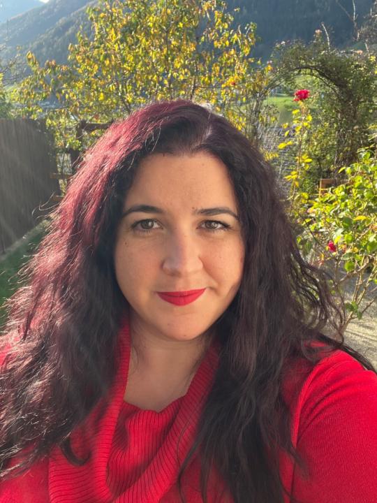
@emese-fur-4564
Squarespace web designer for creative women & small biz owners. Mama, gamer, tech nerd. Turning DIY chaos into clean, scroll-stopping sites.
Active 5h ago
Joined May 13, 2026