Activity
Mon
Wed
Fri
Sun
Aug
Sep
Oct
Nov
Dec
Jan
Feb
Mar
Apr
May
Jun
Jul
What is this?
Less
More
Memberships
Where Colour Dreams | Art Kits
123 members • Free
Art With Courage
87 members • Free
Painters Hub
7.9k members • Free
Paint Better Together
95 members • Free
Serge Ramelli Easy Tutorials
1.7k members • Free
Master Realism Drawing (Free)
1.5k members • Free
Di-Maccio Art Academy
5.2k members • $3/month
Society of Figurative Art
473 members • Free
28 contributions to Paint Better Together

Oct '25 •
How would you approach this?
I have a photograph of a waterfall I took at Yosemite back in 2016, and I’m planning to paint it in oil using four square panels that will be assembled into one frame. I’d like the colors to be as rich and chromatic — or as close to the photograph — as possible. How would you approach the glazing process to achieve that effect? The photo was shot with a full-frame camera, so I have plenty of resolution to zoom in on details though I know I won’t need it because the size will only be 8” x 8” roughly. I think I have the pigments needed to build a matching color palette. My main concern is avoiding muddy or overly dark mixtures once I start layering and mixing colors.
1 like • Oct '25
@Elissa Mora Yes, I got into this group too and saw a landscape value study using only titanium white, burnt sienna and ultramarine blue (I think). I thought of creating something from photos I took so it’ll be more meaningful to me.
1 like • Oct '25
@Elissa MoraNot yet — I’ll be traveling soon, so I haven’t had the chance. But I’ve been researching ways to improve my process and came across the ébauche method (French for ‘first pass’ or ‘quick sketch’) by Steve Forster. It starts with a charcoal or graphite drawing focused on outlines, contrast, and accurate proportions, followed by sealing it with a fixative. The final — and longest — stage is painting with mostly transparent pigments in the beginning. Then followed by gradually building up the layers to completion. I’ve seen some portrait painters from the TV series Portrait Artist of the Year (a competition where thousands of artists compete for the title) use this technique but it didn’t really sink in until I came across this book Painting Luminous Portraits for Artists by Steve Forster. I attached an example of the painting stages from the book showing how it is applied and also a screenshot of the book cover. I find it really interesting.
Oct '25 •
Oil Portrait Study
This is my second oil portrait study, where I focused on exploring brushwork, refining values, and capturing just enough likeness without getting lost in detail. With each layer, I learn a bit more about restraint, rhythm, and how emotion can emerge from the simplest interplay of light and shadow. Still learning — and still enjoying the process.
1 like • Oct '25
@Elissa Mora Thanks for the feedback!
1 like • Oct '25
@Elissa Mora it was an experiment on my part. I have to step back a foot or two in between strokes.
Oct '25 •
Getting into the flow state
Let’s see how much more I change . I really enjoyed playing with the palette knives and silicone brushes .

1 like • Oct '25
Love the texture on the hats!
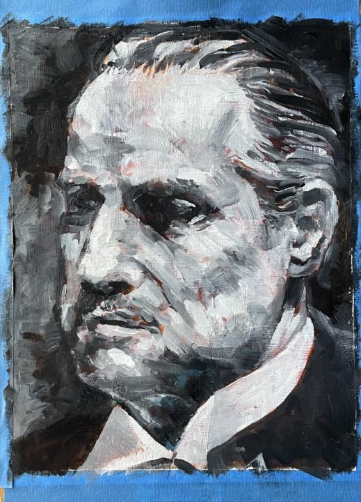
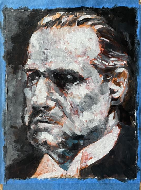
Oct '25 •
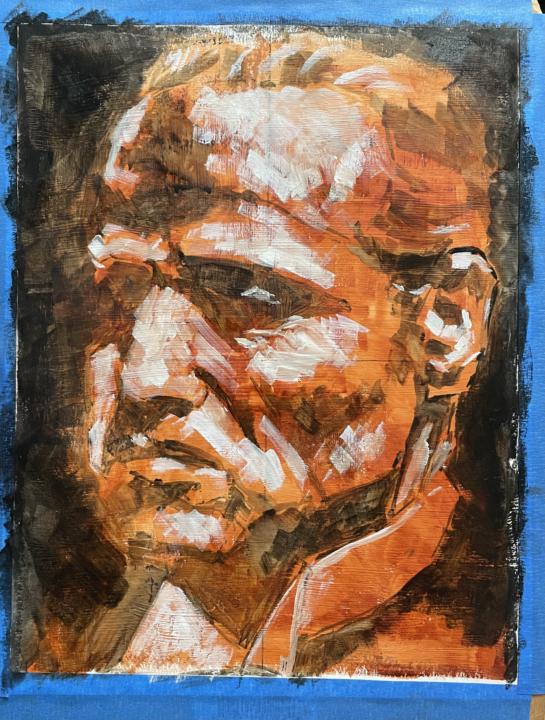
Work in Progress
A work in progress — a monochrome study of Don Vito Corleone. I’m exploring the tension between abstraction and realism, where form begins to dissolve but the presence remains unmistakable. This piece isn’t meant to be an exact copy, but my own interpretation — a way to express the quiet gravity and enduring power that linger beyond the likeness itself. Am I making progress?
Oct '25 •
Finding My Way in Color Mixing
My biggest challenge right now is color mixing. I understand the general concept and truly enjoy the process, but I often feel unsure if I’m heading in the right direction. I recently read an article by Florent Farges about a color mixing exercise that stuck with me. He suggests first finding the pigment (hue) closest to your target color (the tone), then choosing a weaker one to complement it (the base). The tinting ratio he recommends is roughly 60% base, 30% tone, and 10% nuance. It makes sense in theory—but putting it into practice is a whole different story! I end up circling back and forth, asking myself - should continue with this one or start an a new one?
1 like • Oct '25
@Elissa Mora I only use ivory black, burnt sienna, yellow ochre, titanium white and very little of cadmium red. I don’t have green but I get it from Ivory black. What will blue do when added to the mix? It will make it cooler, I suppose.
0 likes • Oct '25
@Elissa Mora Color does not have to be an exact match -- I think this was my problem. I was trying to get a perfect match and in doing so, it becomes muddy. I have to constantly remind myself.
1-10 of 28
@edwin-caniete-1328
Portrait artist and photographer capturing character and expression in pencil, charcoal, and natural or studio light.
Active 61d ago
Joined Aug 27, 2025