Activity
Mon
Wed
Fri
Sun
Aug
Sep
Oct
Nov
Dec
Jan
Feb
Mar
Apr
May
Jun
Jul
What is this?
Less
More
Memberships
The AI Advantage
126.4k members • Free
The AI Identity Lab
152 members • $27/month
The Journaling Community
115 members • Free
2 contributions to The AI Identity Lab

🔥
Nov '25 •
Where are you from? Where do you live?
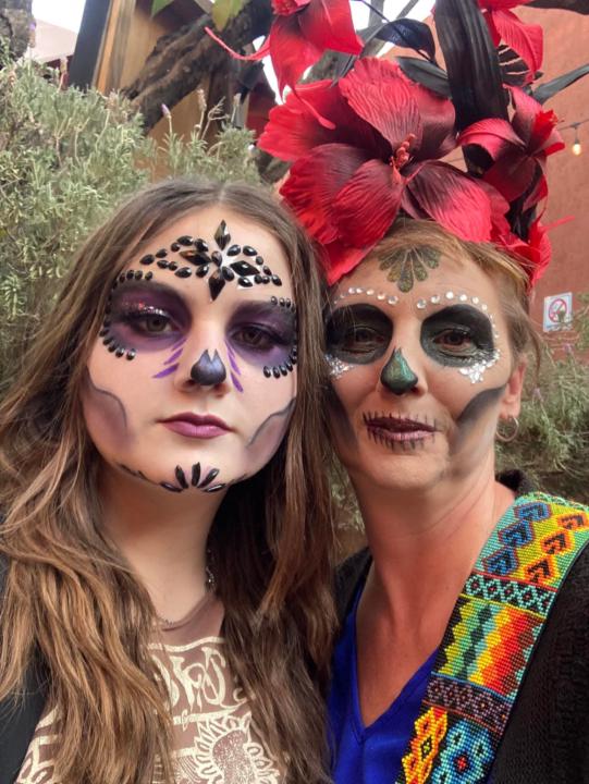
I love looking at the map and seeing members all over the world. Tell me..... 1. Where are you from? 2. Where do you live currently? Bonus points - share a meme or photo!

1 like • Nov '25
Hi, I am from the UK and have only lived here! I was born in Surrey and have lived in Cornwall, the Fens, just south of Glasgow, the Isle of Lewis and now I am settled in Devon (next to Cornwall) South west UK.
🔥
Nov '25 •
I need your honest eyes 👀 Feedback Please!!
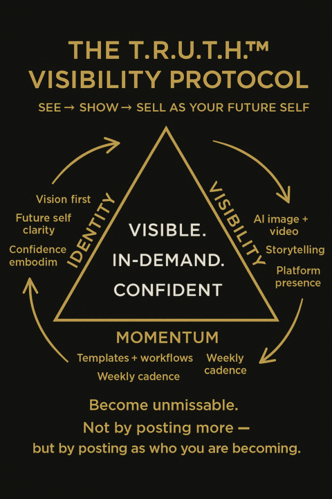
I’m working on a visual model for my new visibility framework — The T.R.U.T.H.™ Visibility Protocol. (It’s the foundation for how I help you SEE → SHOW → SELL as your future self.) I’d love your quick gut-level feedback. Here’s the image 👇 A few questions to guide you: 1️⃣ What’s your FIRST reaction when you look at it? 2️⃣ Does the messaging feel clear + compelling? 3️⃣ What (if anything) is confusing or unnecessary? 4️⃣ Would YOU be curious to learn more after seeing this? Why/why not? 5️⃣ If you could change one thing to make it stronger… what would you change? Bonus points: 🔹 Which word hits hardest — Visible, In-Demand, Confident? 🔹 Anything missing that you WISH was here? Be honest — I’m not looking for compliments. I want the REAL “this hits / this doesn’t” kind of clarity. You won’t hurt my feelings. Promise. Thank you, Lab fam. 🙏This will help shape what comes next inside our world.
0 likes • Nov '25
I have seen the triangle model before, laid out a little differently. This looks busy - maybe ideal as the version you would keep for yourself. Lots of 3 words/phrases in the whole picture makes it visibly tiring for me. A simpler version to show would be better for clarity. Just seen Isabella's comment above, and a build up would be great. In the version I was taught, the word at the bottom is the most significant, the foundation or keystone. I wonder whether IDENTITY would be my choice... The centre is busy with 3 words. Visually would it be better to have them stacked shortest to longest: visible, confident, in-demand? Or use those words verbally and find an alternative word or phrase that embodies these. Visible/visibility looks like repetition. I like the arrows that give the eyes direction.
1-2 of 2
@dawn-roe-6701
60 on the horizon and getting ready to launch my website that has been over a year in the making. I am stuck. Or rather, easily distracted by...
Active 75d ago
Joined Oct 29, 2025
Devon UK
Powered by