Activity
Mon
Wed
Fri
Sun
Jul
Aug
Sep
Oct
Nov
Dec
Jan
Feb
Mar
Apr
May
What is this?
Less
More
Owned by Benjamin
From 500 blood sugar to zero insulin in 6 weeks. No excuses. Just the system. If you're ready to take control — you're in the right place.
Memberships
Pottery People 💛☕️
262 members • Free
Prompt-Shop-in-a-Box
1.5k members • $99
Your First $5k Club w/ARLAN
29.8k members • Free
Skoolers
181.5k members • Free
28 contributions to Systems Over Symptoms

Apr 22 •
Water and Walking — Free and Immediate
Before you spend another dollar on supplements, gadgets, or programs — try these two things first. Water dilutes glucose in your bloodstream. Walking makes your muscles absorb it directly without insulin. Both work fast. Both are free. Both are documented in my own CGM data. This lesson is short, simple, and one of the most immediately actionable in the entire course. Do this today. Check your numbers tonight. See what happens.
0 likes • Apr 29
Thank you my friend
Apr 29 •
Literally it’s just a sister
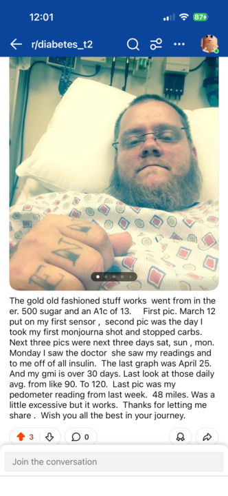
Started in hospital sugar 500 A1c. 13. First two days with sensor which forced accountability. March 13 dropped all carbs started Monjourna . Got take off of my insulin. Started walking . Numbers dropped , A1c way down. That is how the system works. Let me guide you through taking control of this disease
0
0
Apr 10 •
💬 The 6-7 Carb Rule
I want to tell you about the day I almost got fooled. Ice cream sandwiches. Frozen section. Big letters on the front — ZERO ADDED SUGARS. I bought them. Kept buying them. Felt great about my choices. Then one day I actually did the full label math. 14 to 17 grams of total carbohydrates. 14 net carbs per serving. I put them down and never bought them again. Zero added sugars is NOT the same as zero sugar. The food industry counts on you not knowing the difference. Now you know. Go grab something from your kitchen right now. Flip it over. Do the math. Drop your result in the comments — what did you find that surprised you? 🙏
0 likes • Apr 24
@Raine Quinn Phillips Literally happened to me with skinny cow. They got me I was eating them then I realized it was like 14 net carbs. . I realize I never looked cause it said no added s
Apr 22 •
Water and Walking
"Try this today: take a 15 minute walk after your next meal and check your CGM before and after. Drop your numbers in the comments. Let's see what happens."
Apr 22 •
Shot Cycle Trough Days
"If you're on Mounjaro or another GLP-1 — have you noticed your numbers or appetite changing toward the end of your weekly cycle? Which day hits you hardest? Share below."
1
0
1-10 of 28

@benjamin-schulz-4088
I could never fit my bio in here lol. But I’m a cnc machinist who was pushed too far after suffering a stroke at work. Built my own business.
Active 4d ago
Joined Apr 5, 2026
Pittsburgh pa