Activity
Mon
Wed
Fri
Sun
Dec
Jan
Feb
Mar
Apr
May
Jun
Jul
Aug
Sep
Oct
Nov
What is this?
Less
More
Multiply Zero
549
Free
ambITious AI
1.3k
5.0
$9/m
Russ Ward’s AI Mastermind
471
Free
AI Automation (A-Z)
175.6k
Free
PU
P.O.W.E.R University
499
Free
Agency Vault
8.8k
Free
Smart AI Operators
3.8k
Free
PublicAI
8.4k
Free
AI INSIDERS 👨🏻💻
6k
Free
3 contributions to The Chatbot Challenge

Apr '25 •
Random Number Raffle Widget
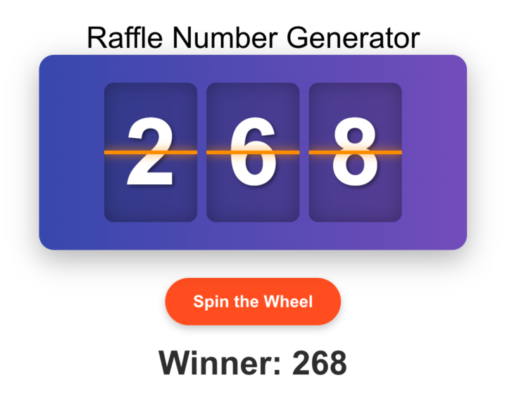
Ever wanted to have a little raffle during a live event or webinar? I got you! In order to create a random number and make it visual, I created this code snippet that is completely self-contained and ready to go. Feel free to edit the colors, etc. Just paste in to the BODY tag wherever you want it to appear. 👇 <!-- COPY PASTE BELOW --> <div class="raffle-container"> <h1>Raffle Number Generator</h1> <div class="wheel-container"> <div class="wheel"> <div class="digit-container" id="hundreds-container"> <div class="marker"></div> </div> <div class="digit-container" id="tens-container"> <div class="marker"></div> </div> <div class="digit-container" id="ones-container"> <div class="marker"></div> </div> </div> </div> <button class="button" id="spin-button">Spin the Wheel</button> <div class="winner-number" id="winner-display"></div> </div> <script> document.addEventListener('DOMContentLoaded', function() { // Elements const hundredsContainer = document.getElementById('hundreds-container'); const tensContainer = document.getElementById('tens-container'); const onesContainer = document.getElementById('ones-container'); const spinButton = document.getElementById('spin-button'); const winnerDisplay = document.getElementById('winner-display'); // Variables let spinning = false; let digitElements = { hundreds: [], tens: [], ones: [] }; // Create all possible digits (0-9) for each position function createDigits() { // Create digits for hundreds (0-9) for (let i = 0; i < 10; i++) { const digit = document.createElement('div'); digit.className = 'digit'; digit.textContent = i; if (i === 0) digit.classList.add('visible'); hundredsContainer.appendChild(digit); digitElements.hundreds.push(digit); } // Create digits for tens (0-9) for (let i = 0; i < 10; i++) { const digit = document.createElement('div'); digit.className = 'digit'; digit.textContent = i; if (i === 0) digit.classList.add('visible'); tensContainer.appendChild(digit);

2 likes • May '25
Great fun @Josh Rosenfeld . I couldn't resist amending it slightly to allow the user to input the number (and gave it a wee tweak!) 🤷♂️ <!DOCTYPE html> <html lang="en"> <head> <meta charset="UTF-8" /> <meta name="viewport" content="width=device-width, initial-scale=1.0"/> <title>Random Number Generator</title> <style> .raffle-container { max-width: 500px; margin: 0 auto; text-align: center; font-family: Arial, sans-serif; padding: 20px; } #max-input { font-size: 16px; padding: 8px; width: 200px; margin-bottom: 20px; border-radius: 4px; border: 1px solid #ccc; } .wheel-container { background: linear-gradient(to right, #3f51b5, #7e57c2); border-radius: 16px; padding: 30px 20px; box-shadow: 0 10px 30px rgba(0, 0, 0, 0.3); margin-bottom: 30px; position: relative; overflow: hidden; } .wheel { display: flex; justify-content: center; margin: 0 auto; height: 150px; position: relative; } .digit-container { width: 100px; height: 150px; margin: 0 5px; background-color: rgba(0, 0, 0, 0.2); border-radius: 10px; overflow: hidden; position: relative; box-shadow: inset 0 0 20px rgba(0, 0, 0, 0.3); } .digit { position: absolute; width: 100%; height: 100%; display: flex; align-items: center; justify-content: center; font-size: 100px; font-weight: bold; color: white; text-shadow: 2px 2px 4px rgba(0, 0, 0, 0.5); opacity: 0; transition: opacity 0.1s ease; } .digit.visible { opacity: 1; } .marker { position: absolute; left: 0; right: 0; height: 4px; background-color: #ff9800; top: 50%; transform: translateY(-50%); z-index: 10; box-shadow: 0 0 10px #ff9800; } .button { background-color: #ff5722; color: white; border: none; border-radius: 30px; padding: 15px 30px; font-size: 18px; font-weight: bold; cursor: pointer; transition: all 0.3s ease; box-shadow: 0 4px 8px rgba(0, 0, 0, 0.2); } .button:hover { background-color: #e64a19; transform: translateY(-2px); box-shadow: 0 6px 12px rgba(0, 0, 0, 0.3); } .button:active { transform: translateY(0);
Nov '24 •
🚨 Nov. 7th: Vapi Voice Chatbot Challenge
Ok I’m doing a Vapi voice chatbot challenge on Thursday, November 7th at 6pm CST (Chicago). 👉 Calendar Link Here You will learn how to write a prompt for your voice chatbot. You will learn how to set up Vapi with OpenAI. You will learn how to use a custom voice with 11labs. You will learn how to buy and setup a new phone number to use with your voice chatbot. What industry or niche should I do? Let me know! Josh 🤖

0 likes • Nov '24
Energy cost reduction brokers - calling to reduce the cost of utility bills (much needed).

May '24 •
DBR- LC phone SMS ramp up Restrictions
Managed to get a client having 22k leads looking to start with DBR at 25% commission for close deal. How do we get away with the restriction on sending sms .. Level 1- 100 sms limit Level 2- 250 sms Level 3- 500 sms Level 4- 750 sms Level 5 - 1500 sms Level 6- 2250 sms Level 7- 3000 sms Level 8- 3000+ Per day sms limit and will get pause once we hit the limit everyday.
2 likes • May '24
Here's an accelerated workaround that might help after the first 7 days. 1) Make a note of your location ID. 2) Start the support widget and click on live chat. 3) Tell the bot you want to increase the sub account limit to say 10,000 per day. 4) The support bot will say give me a moment to see if I can find how to help. 5) The bot will offer you guidance from the knowledge base (which isn’t going to help). 6) Tell the bot the query is unresolved. 7) The bot will ask you for your sub account ID. 8) Then the bot will ask if you have a loom video recording - say no to that. 9) The bot will connect you to a GHL agent/assistant. 10) Explain to the GHL agent what you need and they will look at your request and most likely will increase the limit. 12 If the support agent seems unsure, copy and paste this instruction for them “go into the backend ISV support endpoint, and paste location ID" 11) It’ll likely take a few minutes and then the increase will be reflected in your sub-account. 12) The other option is using Twilio inside of GHL (instead of lead connector).
0 likes • Jun '24
I forgot to say that toll free numbers require much less information and are much quicker to get approved.
1-3 of 3

@alan-bonner-9643
Entrepreneur~Business Veteran aiming to help you avoid all the "Dumb-Ass" mistakes I've made on my journey to 39 companies 🤦🏻♂️ www.AlanBonner.com
Active 8m ago
Joined May 15, 2024
INFJ
Florida
Powered by