Activity
Mon
Wed
Fri
Sun
Aug
Sep
Oct
Nov
Dec
Jan
Feb
Mar
Apr
May
Jun
Jul
What is this?
Less
More
Owned by Diana
𝐁𝐫𝐚𝐧𝐝 𝐀𝐫𝐜𝐡𝐢𝐭𝐞𝐜𝐭𝐮𝐫𝐞- Strategy & identity for soul-led entrepreneurs. Refine your message. Align your brand. Design your future.
Memberships
The Success Club
14.3k members • Free
Creative AF Club
156 members • Free
Panda for Skool CRM +
425 members • $36/month
KNOW YOUR COLOR ENERGY
95 members • Free
Retreat Builders
336 members • Free
Guitar for Beginners
258 members • Free
Read SkoolMagazine Here
316 members • Free
LHV Connection✨💗🦋
189 members • Free
TheArtCollectiveInternational
87 members • Free
39 contributions to TheArtCollectiveInternational

🔥
2d •
🪨 Rocks
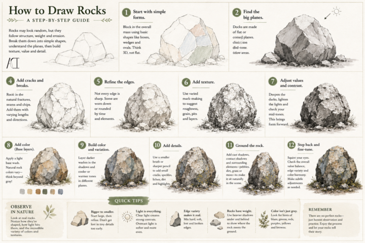
Rocks aren’t complicated~ they’re just honest. When people first try drawing rocks, they often focus on every crack and texture they can see. The result usually ends up feeling busy instead of believable. Start by finding the largest shapes first~ Every rock has a sense of weight~ Think about where it rests, how its surfaces catch the light, and which planes turn away into shadow. Once that foundation is solid, you can begin adding smaller chips, fractures, rough textures, and subtle color variations. Another thing to remember: nature rarely repeats itself. Some rocks are smooth from years of moving water. Others are jagged from fresh breaks. Some are covered in moss or lichen, while others have sharp edges that haven’t had time to weather. The more you observe real rocks, the more you’ll notice they tell the story of where they’ve been. Slow down, study the forms, and let the texture come last. What’s your favorite kind of landscape to draw~ mountains, forests, beaches, or deserts?

2 likes • 1d
I like to draw beaches and forest the most. But I just realized now that don't usually include rocks! I'm going to to have to practice incorporating them more, since I love texture and contrast of elements
🔥
3d •
☁️ Painting Clouds: Beyond Fluffy
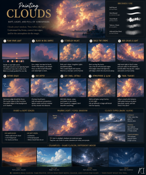
Whether you paint digitally or traditionally, clouds follow the same principles: form, light, value, and atmosphere. The tools may be different, but the fundamentals don’t change. A few things to be conscious of: ☁️ Start with the big shapes. Don’t paint every puff individually. Squint at your reference and look for the overall silhouette first. Think about sculpting one large form before carving out the details. ☀️ Choose your light source first. Clouds don’t glow everywhere equally. Decide where your sun or light source is before you begin. Your highlights, shadows, and even the colors in the sky should all support that decision. 🎨 Edges tell the viewer where to look. Not every cloud edge should be crisp. Hard edges naturally draw attention, while soft edges create depth and atmosphere. A painting with only hard edges~ or only soft ones~ often feels flat. 🌤️ Shadows have color. Cloud shadows aren’t just gray. They often reflect the color of the sky, picking up blues, violets, and cool grays. During sunrise or sunset, those relationships shift into warmer hues. 🌫️ Suggest more than you describe. Clouds are constantly changing. If you paint every little bump and wisp, they can start to feel stiff. Suggest the forms, then let the viewer’s eye finish the rest. Traditional vs. Digital 🎨 Traditional artists: Work from light to dark (or dark to light, depending on your medium), and remember that lifting paint, glazing, and preserving your whites all create different cloud effects. Watercolor, gouache, acrylic, and oils each handle edges differently~ lean into what your medium does best instead of forcing it to behave like another. 💻 Digital artists: It’s tempting to rely on cloud brushes, blur tools, or smudge tools, but they work best after you’ve established the form. Build the cloud first, then use your digital tools to enhance it—not to replace the underlying structure. One last tip… GO OUTSIDE~!!! Some of the best cloud studies you’ll ever make won’t happen at your desk.
2 likes • 3d
ooooh! i wish i had packed paints for my trip! I've been staring at the sky all week and ever since I was child Ive loved to stare at the clouds as they move in form creating new visuals and animals and pictures. Mom always told not to stare at the sun, but Im such a rebel haaaha-- I always lookk to the sky and fall into peacefulness.
🔥
14d •
The Art of a Good Logo
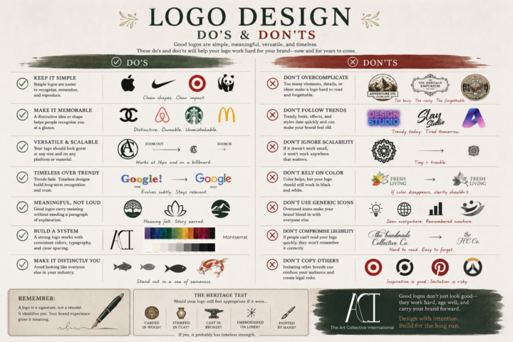
A logo doesn't have to tell your entire story. It isn't your mission statement, your values, or your elevator pitch. A logo is like a signature~ Its job is to identify you clearly, consistently, and confidently. The meaning comes from everything you build around it~ your work, your reputation, your community, and the experiences people have with your brand. That's why some of the most recognizable logos in the world are also some of the simplest. When you're designing a logo, ask yourself: • Can someone recognize it at a glance? • Will it still work at the size of a favicon and on a storefront? • Does it still make sense in black and white? • Is it memorable because of its shape, not just its color? • Will it still feel relevant in ten or twenty years? A great logo doesn't have to be the loudest in the room~ I can be the one that quietly becomes familiar through years of good work. Design with intention~! Build for the long run~!
1 like • 11d
This is the best!!🙌🏽
🔥
14d •
Color Theory and Color Psychology Basics~
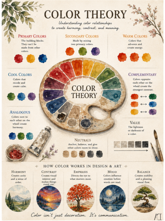
Color is one of the first things people notice~ but it's often the last thing people truly study. Understanding color theory isn't about memorizing a wheel. It's about learning how colors relate to one another, how they guide the eye, create harmony, build contrast, and influence the feeling of a piece. Whether you're painting with watercolor, working digitally, designing a logo, or decorating your home, the same principles apply. Color isn't just decoration. It's communication~ Every color tells a story. Sometimes that story is loud. Sometimes it's subtle~ But~ it changes completely depending on where you live or the experiences you've had. That's why color psychology isn't a rulebook~ it's a conversation. The colors we choose influence mood, expectations, and memory long before someone reads a single word. Whether you're building a brand, painting a landscape, or choosing colors for your home, ask yourself: What do I want someone to feel before they think?
1 like • 13d
Ahhh color theory!! I have a neverending love for the psychology of colors. 🥰Such a great post. I love the visuals

3 likes • 17d
@Hansheng Lee Your vision and expression of art is such and inspiration!
1-10 of 39

@diana
𝐀𝐫𝐜𝐡𝐢𝐭𝐞𝐜𝐭 𝐨𝐟 𝐀𝐥𝐢𝐠𝐧𝐞𝐝 𝐁𝐫𝐚𝐧𝐝𝐬
Guiding conscious creators into clarity, alignment, and flow.
Active 24m ago
Joined Feb 8, 2026
Arizona