Activity
Mon
Wed
Fri
Sun
Aug
Sep
Oct
Nov
Dec
Jan
Feb
Mar
Apr
May
Jun
Jul
What is this?
Less
More
Owned by Andrew
Memberships
Chase AI Community
71.4k members • Free
AI Academy
97 members • Free
Funnels University
1.1k members • Free
Selling Online / Prime Mover
36.7k members • Free
Free Skool Course
71.6k members • $1
OfferLab
9.5k members • Free
Kollege
1.2k members • Free
Community Builders
8.1k members • Free
Freedom Fastlaner
6.5k members • Free
29 contributions to Selling Online / Prime Mover

5h •
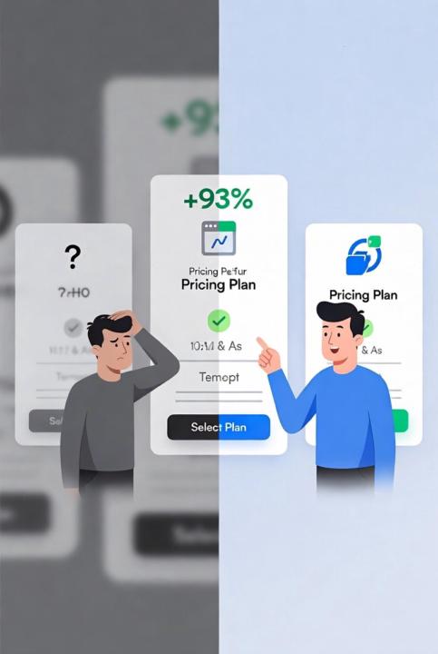
A confusing pricing page, then 93% more signups from two fixes.
An event-software company had a pricing page where prospects couldn't decide which plan to pick. Indecision equals no signup. Two changes: 1. They showed the full feature list for every plan, side by side, so nobody had to guess what they'd get. 2. They put a separate CTA button on each plan instead of one button at the bottom. Signups went up 93%. People rarely abandon a pricing page because the price is too high. They abandon because they can't tell which option is "the one for me," and confusion converts worse than sticker shock. Open your pricing or order page and ask one question: could a stranger pick the right plan in five seconds? If they'd have to hesitate, scroll back up, or compare in their head, that hesitation is your leak.
1
0
1d •
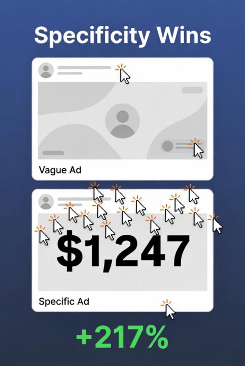
Putting a number in the headline lifted click-through 217%
A small headline change with an outsized effect: include exact numbers. Test #1: - A: "The first ever public library of tested marketing strategies online." - B: "10 patented strategic guides. 1,500+ proven tests. Free access." - B won by 88%. Test #2: - A: "Local Tax Preparation – Quality Tax Preparation Services." - B: "Local Tax Preparation – $45,325 Saved in January." - B won by 217%. Vague claims slide right past people. A specific number stops the scroll because it reads as real, measured, and credible. "$45,325 saved" is impossible to ignore. "Quality service" is impossible to remember. Anywhere you've written a fuzzy benefit, see if there's a number hiding behind it. Not "save money," but how much. Not "fast," but how fast. What's one vague line in your funnel you could swap for a hard number today?
16d •
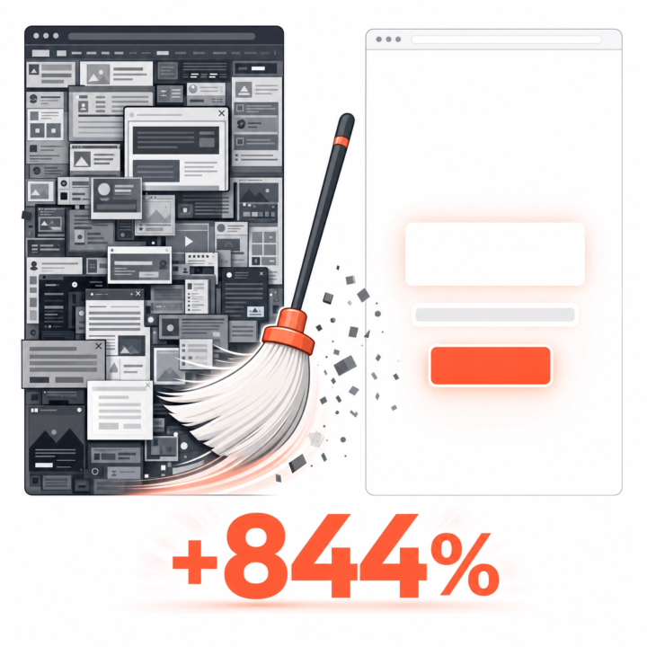
They deleted half the landing page. Conversions went up 844%
A marketing company had the usual landing page: video, signup form, "featured in" logos, a description, a how-it-works section, money-back guarantee, support promise, team bios. The works. They threw almost all of it out. New version: a signup form, a 6-word headline, an 8-word subtitle. Nothing else. Signups went from 1.39% to 13.13%. An 844% increase. Every extra section on an opt-in page is one more reason to think, scroll, hesitate, and leave. More page is not more persuasive. Usually it's just more friction. This is the hardest one for funnel builders to swallow, because we love building. But your opt-in page almost certainly wants fewer sections, not more. Try this: cut your opt-in page down to a headline, a subhead, and the form. Run it for a week against your current one. I'd bet on the stripped version.
0 likes • 4d
@Jesus Perez longer opt-in pages don't necessarily increase lead quality, but definitely decrease opt-in rate.
7d •
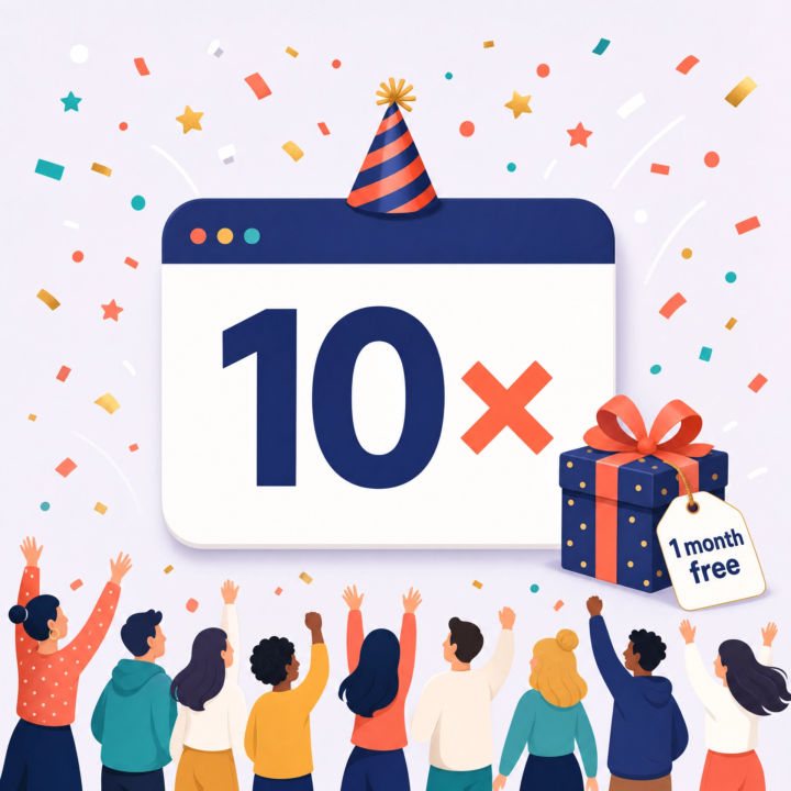
DigitalOcean 10x'd opt-ins by pretending it was their birthday
DigitalOcean had a free-trial popup converting at a miserable 0.21%. They changed almost nothing about the offer. They changed the reason for it. The new popup: "Wait! It's our birthday, but you get the present. 1 month free cloud hosting. Code: HBD2CW." Opt-in rate jumped 10x. Then they got greedy and tried it for other occasions, Independence Day, Halloween, Christmas. Every single one pulled 10–15x the original rate. The lesson: the same offer feels completely different when there's a reason behind it. "Here's a discount" is noise. "Here's a discount because it's our anniversary" gives people permission to act now. A reason, even a flimsy one, beats no reason at all. What's the story behind your current offer? Or is it just sitting there, naked, with no excuse for existing today?
8d •
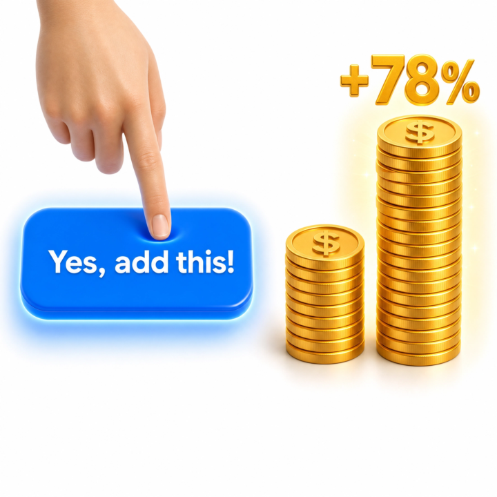
One 1-click upsell = 78% more revenue from the same buyers
SamCart dug into their users' data and found that sellers who add a single 1-click upsell after the main purchase increase their average customer value by 78%. Same traffic. Same front-end offer. Same ad spend. Just one extra offer shown after someone's already bought, while their card is out and they trust you. This is the part of the funnel most people in this group skip, and it's the cheapest money you'll ever make. The hard part, earning enough trust for the first purchase, is already done. The upsell is just "would you also like…" to someone who already said yes. If your funnel ends at the first sale, you're leaving most of your profit on the table. What's the obvious "and also this" you could offer one click after checkout? Most people have a perfect upsell sitting in their product line and never present it.
1-10 of 29
@andrew-bobchenok-9617
Certified Clickfunnels & Funnelytics Expert. I will optimize your funnel FOR FREE for 30 days
➡️ DM me
Active 5h ago
Joined Aug 20, 2024
Powered by