Activity
Mon
Wed
Fri
Sun
Aug
Sep
Oct
Nov
Dec
Jan
Feb
Mar
Apr
May
Jun
Jul
What is this?
Less
More
Memberships
True Math Mastery
104 members • $18/month
Synthesizer: Free Skool Growth
44.5k members • Free
Your First $5k Club w/ARLAN
32.4k members • Free
Remote Job Club Europe
6 members • $5/month
Roast & Promote 🔥📢
229 members • Free
🎮 OnlyLANs Gaming Group
157 members • Free
Magnetic Memberships
3.9k members • Free
Six-Figure Graphic Designers
1.3k members • Free
Business Builders Club
8k members • $33/month
63 contributions to Roast & Promote 🔥📢

25d •
Would you please roast my About Page?
After watching Skool News, I took a scalpel to my copy for the thousandth time (tell me I'm not alone in this!) I'd love to hear what you think. It's for my community The Level Up Lounge. Stop looping in self-doubt. Start showing up with calm confidence and a secure sense of who you are. One woman said this work took her “from rock bottom to finding myself and standing up for me.” Another called the 7-Day Self-Love Challenge “medicine for the soul.” If you’re a midlife woman and you're: • Second-guessing yourself • Stuck in old patterns • Tired of overthinking This is for you. Most women don’t lack wisdom. They lack a clear way to hear it, trust it, and act from it. I’ve spent 30+ years helping women move from survival patterns into self-trust. Inside you’ll learn how to: ✔️ Catch old patterns in real time ✔️ Interrupt spirals before they run the show ✔️ Rebuild self-trust and inner authority Inside you’ll get: ✅ Coaching calls: see what you can’t see alone ✅ 7-Day Self-Love Challenge: come back to yourself ✅ Live masterclasses + Community: so you're not reclaiming identity alone 🎁 FREE 20-minute 1:1 Breakthrough Call 🚀 Ready to level up your mind & level up your life? Join now

2 likes • 24d
Hey @Jennifer Juniper.I really love what you were doing, and honestly it is super inspiring! Just a couple of small things I noticed when I checked out the page: There is no consistent brand color across it, and the banner background feels a bit too bright. Also, the lower grid could be a bit smaller for neatness, and you could be a little bigger in the frame. But overall, everything feels really good!
1 like • 18d
@Jennifer Juniper Welcome and that's what I mean

20d •
Des is the man!
And I'm happy that he earned this pinned post. If you don't know @Des Dreckett and you're not on his communities, you should. He is the realest skooler here, one of the few people that I trust to give real advice on how to make money, without exagereted claims or generic advice that feels flat. Everyone that I referred to him was very grateful for it. So if you're a YouTuber and want to get monetized and increase your audience, or just use YouTube as a way to build your business go to The Content Revenue Lab. And if your game is focusing on monetizing skool, go to Skool Monetization Lab. Both are awesome and he will help you a lot.

2 likes • 19d
@Des Dreckett Congratulations on the win
28d •
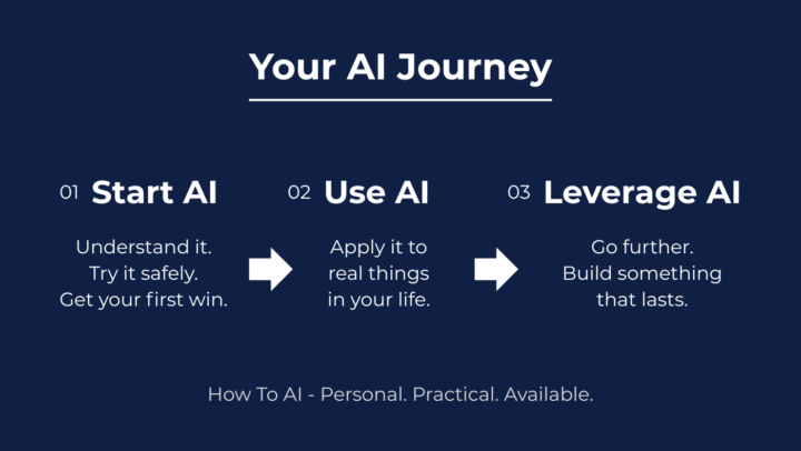
Learn How to AI! RoW #16
@Matthias Schweiker will help you take your first confident step with AI in 14 days. And if you've been active here, you know how helpful he is! So if you want to improve the way you use AI, join this amazing Skooler at How To AI! You are free to start and go at your own pace. 100% DIY. If you like there are classes & coaching. 🗺️ How it works: - Start AI >> understand it, try it safely, get your first win - Use AI >> apply it to real things in your life - Leverage AI >> go further, build something that lasts ✅ What's inside: - A beginner-friendly classroom - Real use cases - Personal support from myself - a software developer, professional teacher and someone who has helped hundreds of people across ages and backgrounds. 💬 Any examples from real people? - Bruno created an AI song for his fiancée - her reaction was pure joy. - Mumtaz encountered a challenge in a project. After I supported her, we became business partners. 👉 Join free. Answer three questions. He'll reach out personally!
3 likes • 27d
@Matthias Schweiker Amazing win
Jun 5 •
Next Level Tennis 🎾
Hey everyone, I have launched a new tennis project, please take a look at it and roast it! https://www.skool.com/next-level-tennis-6505
3 likes • 27d
@David Solar Let me start with the positives the video quality is amazing, the niche is very unique and I love the color choices that help you stand out. That said there are a couple of things worth improving. The first video feels a bit basic, which means it is not grabbing attention within those crucial first 5 seconds, making the overall feel come across as amateur. Adding dramatic animated text or exciting b-roll that matches the topic would make a big difference. The second thing is the cover designs right now it feels like everything was just placed on without much thought. To elevate them, I would suggest using guiding design elements like a shadow bar behind the text, trimming the wording down to only what is essential and adding a grid or border around the photos to give them a framed look that aligns with the height of the text. You can use Canva to guide you on this
Jun 4 •
Wpp and Telegram CTAs are always a scam
I was suspicious from the beginning but I want to give her a chance. Turns out it was really a scam. Sorry about that. Most scammers here can barelly speak comprehensive english so since this one was very communicative I gave her the benefit of the doubt. Ill be more strict with who I let in here.
3 likes • Jun 5
Hope no one got scammed though
3 likes • Jun 5
@Eric William Sadly true
1-10 of 63

@kevin-karanja-7879
Video editing & design for creators with vision. You bring the drive, I make it look world class. DM me.
Active 9h ago
Joined Feb 18, 2026