
Pinned
🔥
6h •
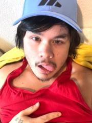
Pet Gratitude
Morning pats with the dogs is always a win. Busy household with the kids. Nice to give the puppies some love.
Pinned

🔥
2h •
The Power of Just Showing Up
….𝐲𝐨𝐮 𝐤𝐧𝐨𝐰 𝐰𝐡𝐚𝐭 𝐭𝐡𝐞 𝐛𝐢𝐠𝐠𝐞𝐬𝐭 𝐬𝐞𝐜𝐫𝐞𝐭 𝐭𝐨 𝐬𝐮𝐜𝐜𝐞𝐬𝐬 𝐢𝐬???.... SHOWING UP. Sounds too simple, right? But after organizing over 500 events in San Francisco, I can tell you MOST people don't do it. They talk about throwing parties. They plan. They dream. They make excuses. But they don't SHOW UP consistently…. ….𝐚𝐧𝐝 𝐭𝐡𝐚𝐭'𝐬 𝐰𝐡𝐲 𝐭𝐡𝐞𝐲 𝐧𝐞𝐯𝐞𝐫 𝐬𝐞𝐞 𝐫𝐞𝐬𝐮𝐥𝐭𝐬…. Showing up means going to that networking event even when you're tired. Following up with that venue owner even when they haven't responded. Throwing that next party even when the last one was rough. In nightlife and in business, CONSISTENCY beats talent every time. The people who last aren't the most skilled. They're the ones who KEEP SHOWING UP when everyone else quits. One of my early mentors told me: "Half the battle is just being there." He was right. ….𝐬𝐨 𝐬𝐡𝐨𝐰 𝐮𝐩…. "𝙀𝙞𝙜𝙝𝙩𝙮 𝙥𝙚𝙧𝙘𝙚𝙣𝙩 𝙤𝙛 𝙨𝙪𝙘𝙘𝙚𝙨𝙨 𝙞𝙨 𝙨𝙝𝙤𝙬𝙞𝙣𝙜 𝙪𝙥." — Woody Allen… I actually believe it is more like 100% 😉 Where do YOU need to show up more consistently?…waiting for your insights below…so comment… NOW 😉

Pinned

🚀
⭐
🔥
18h •
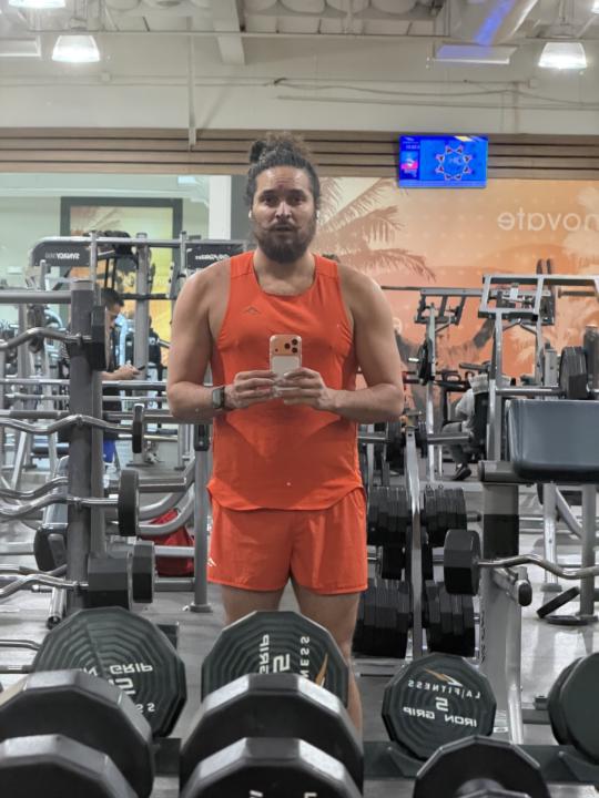
☀️ My anti-blitz
Anti-Blitz ends tomorrow. This month I chose physical fitness again. And now that the world tour has come to a close, I have been going CONSISTENTLY Two weeks ago was the first picture. This week is the right picture. I’m using everything I can to fuel my focus. And I’ve noticed that oddly enough sad songs Motivate me sometimes more than the intense ones It’s working. And I’m feeling much better in my body. almost how I felt at two years ago, When I was my fittest- just before joining Skool lol I will be sharing more of this from my side fo SHO How is ur progress coming??


just now •
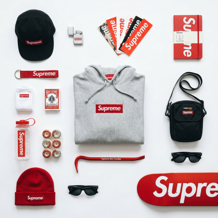
🟥 Flat Lay Brand System Prompt
This is one of the cleanest ways to make a brand look premium without overcomplicating it. Instead of generating one random product image, you build a structured flat lay that shows the full lifestyle around a brand. It works for: • Portfolio pieces • Mock campaigns • Pitching brands • Etsy / print posters • Instagram carousels • Paid client concepts The key is structure, spacing, and color control — not chaos. Here’s the full template 👇 ⸻ TEMPLATE [BRAND NAME]. Act as a Product Photographer and Art Director specializing in editorial still life and brand identity visual systems. ⸻ PHASE 1: CONCEPTUAL FRAMEWORK Create a curated flat lay composition that visualizes brand ubiquity through everyday objects. This is a “branded universe” – a knolling-style arrangement where [BRAND NAME] appears consistently across lifestyle objects. The image should feel like opening a collector’s essentials kit. ⸻ PHASE 2: OBJECT SELECTION Autonomously select 10–15 objects that represent [BRAND NAME]’s lifestyle ecosystem: • Mix apparel, accessories, and small everyday objects • Match objects to the brand identity • Mix large anchor items with smaller detail items • Branding must be visible but natural ⸻ PHASE 3: KNOLLING RULES • Clean grid alignment • Objects parallel or perpendicular • 2–5cm spacing between items • Even visual balance • Hero product placed in center or golden ratio • Nothing cropped ⸻ PHASE 4: COLOR CONTROL • 80% neutral base • 15–20% signature brand color • Brand color repeated across multiple objects • Mix matte and glossy textures while staying color disciplined ⸻ PHASE 5: CAMERA & LIGHTING • Perfect overhead angle • 50–80mm lens • f/8–f/11 (everything sharp) • Soft diffused light • Minimal soft shadows • Clean white or light gray background ⸻ PHASE 6: FINAL POLISH • Bright, clean color grade • Slight desaturation • Medium-low contrast • Subtle accent color boost ⸻ If you try this, post your version below.
0
0
1-30 of 12,261

Leaderboard (30-day)
1
🔥
+4083
2
🔥
+2928
3
+2421
4

🔥
+1830
5

🔥
+1826
Powered by